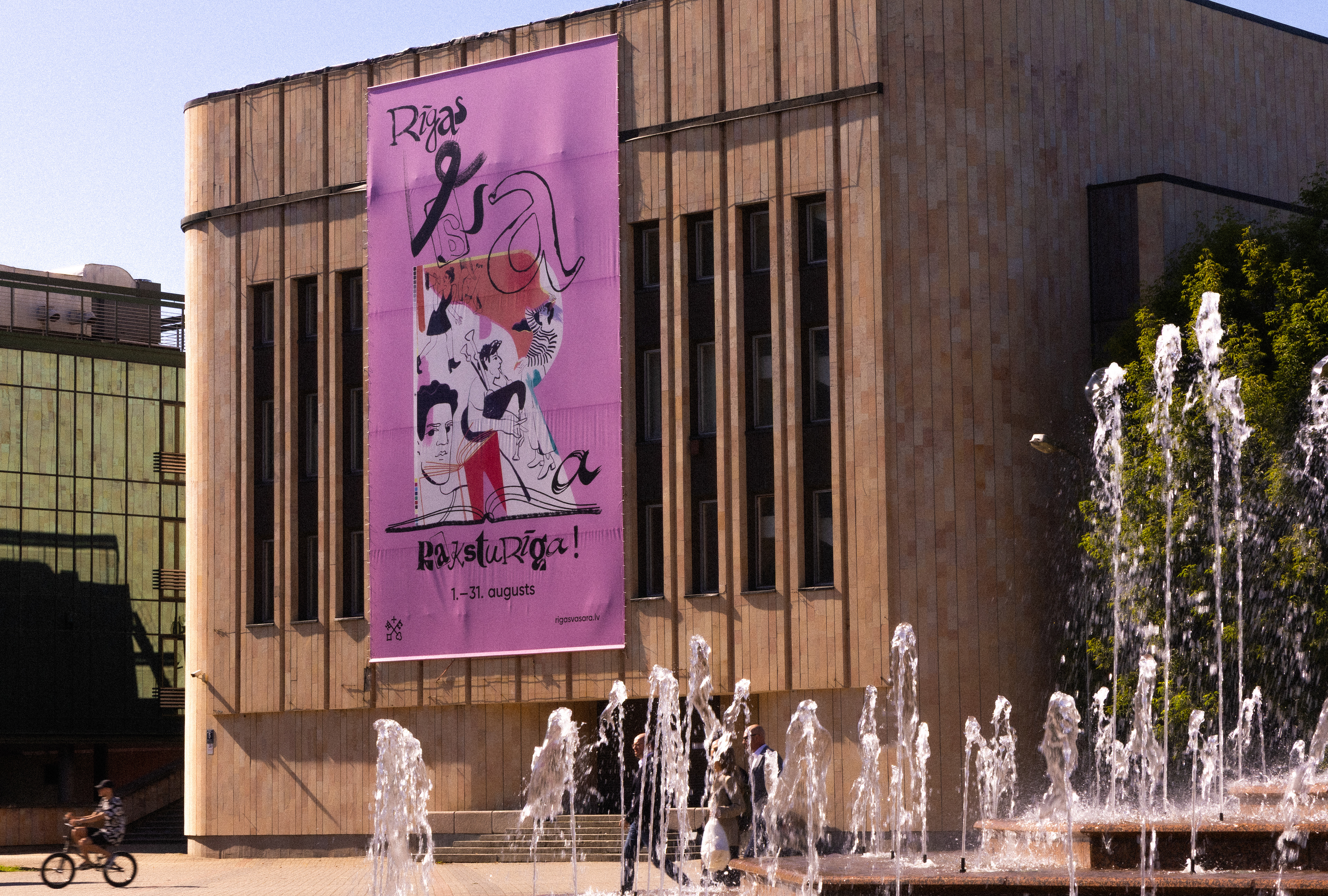
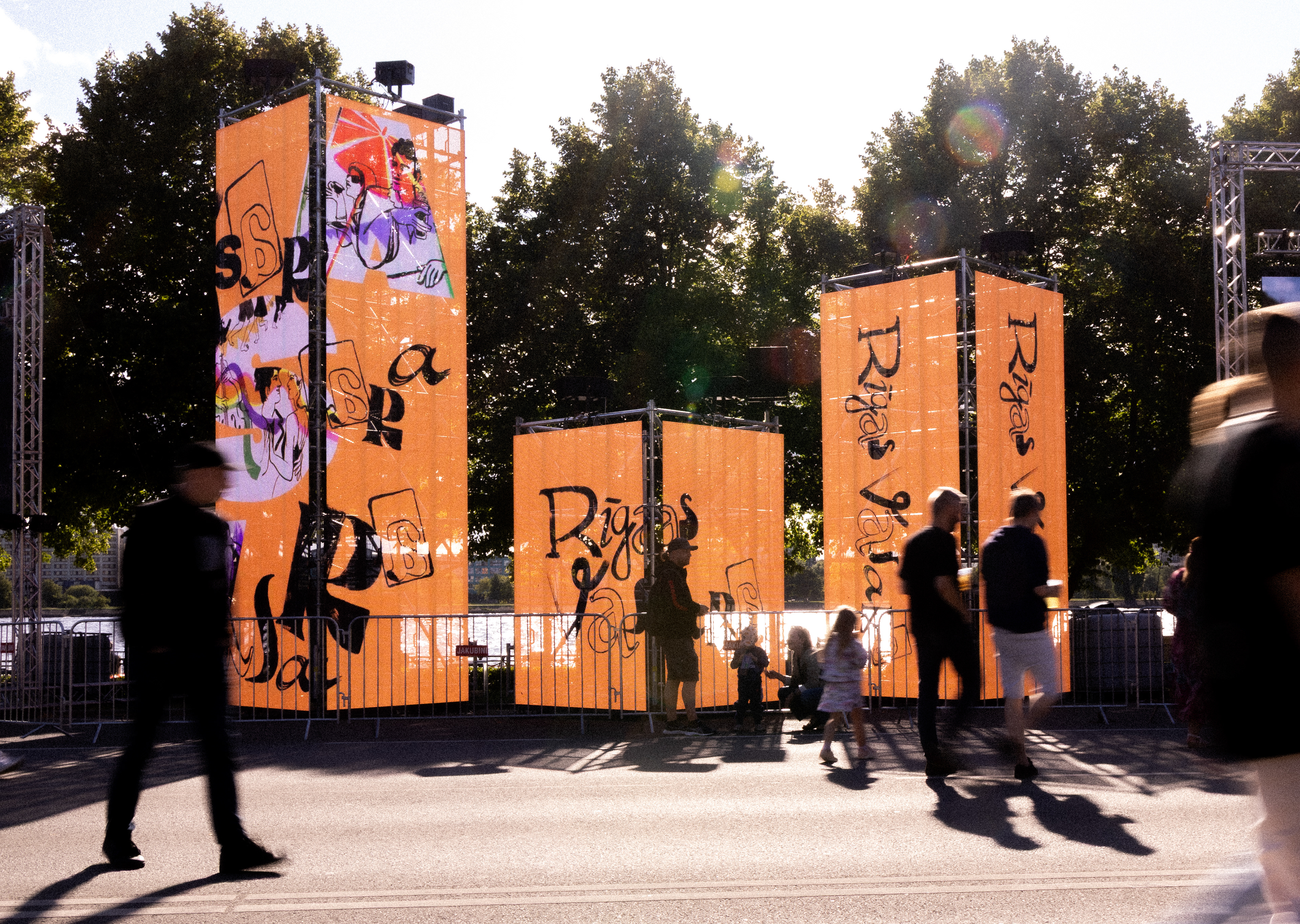
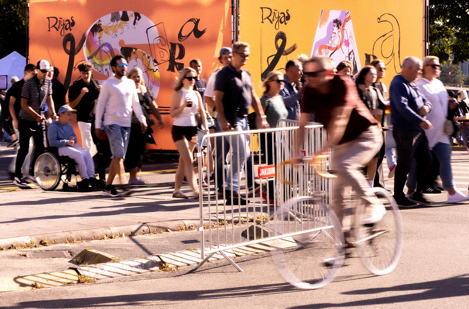
Visual Identity for Riga City Celebration Month – August 2025
Client: Riga City Council
Producer: Creative Union – I did it
Art direction, Illustration: Ella Mežule
Technical Design: Matīss Zvaigzne
Project manager: Laura Vizbule

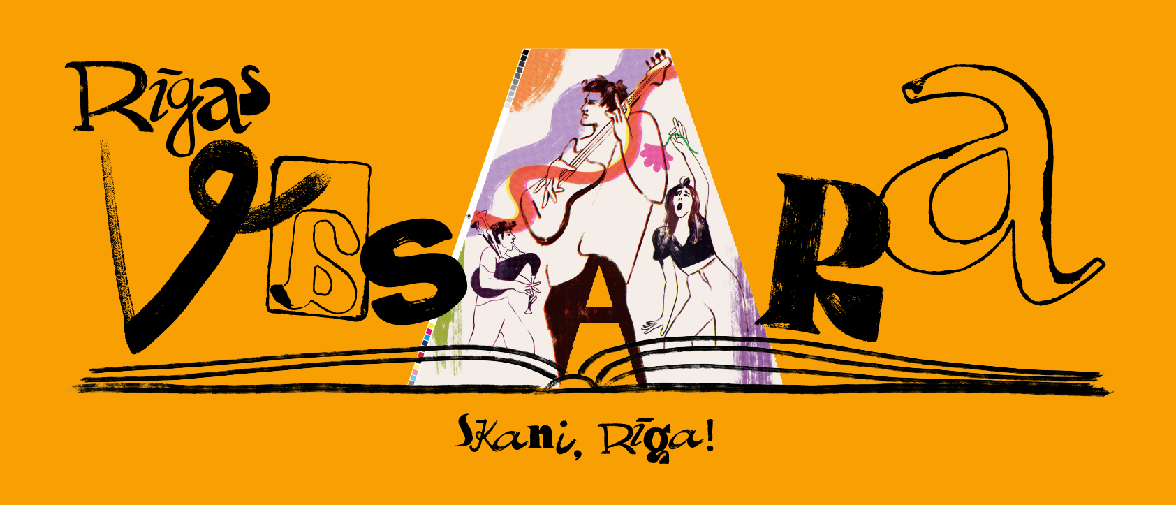
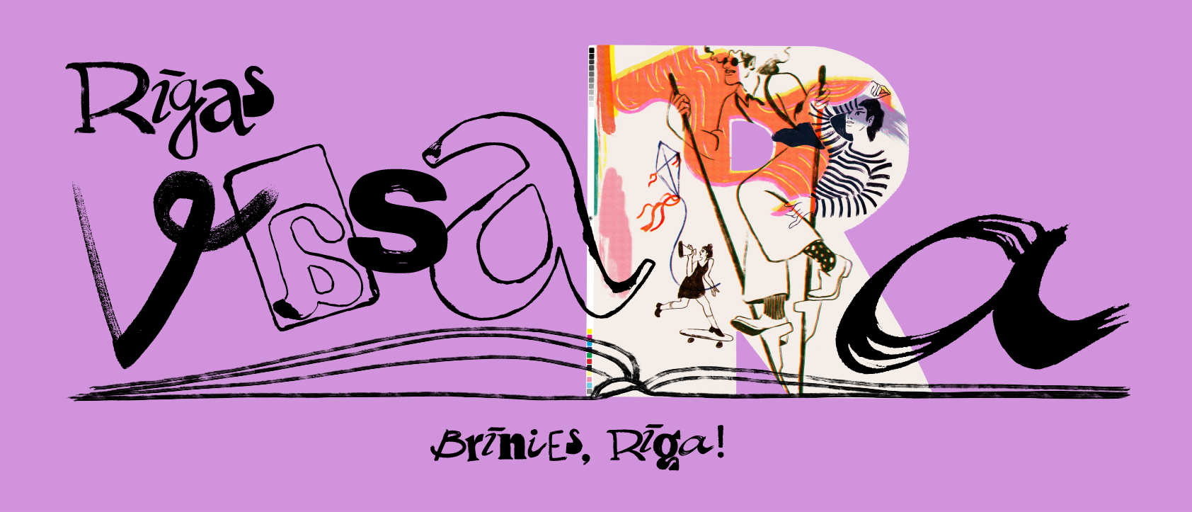
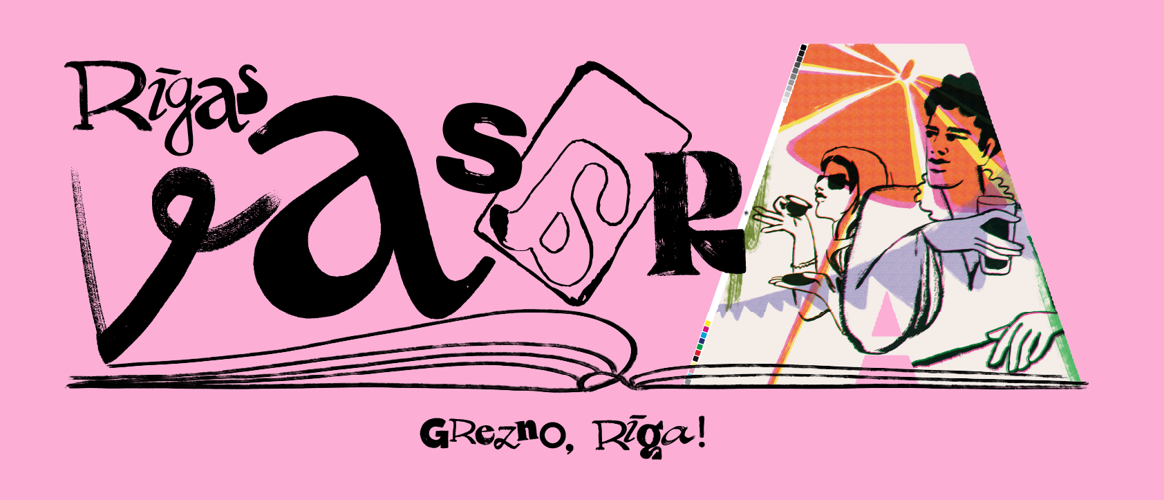
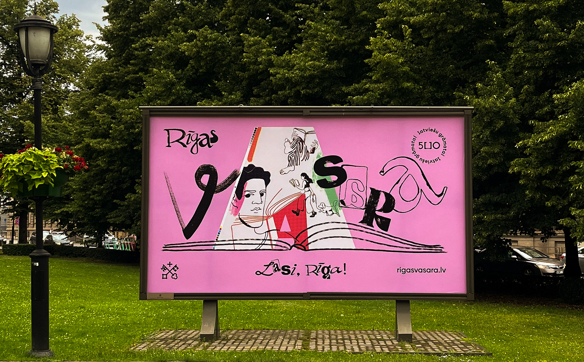
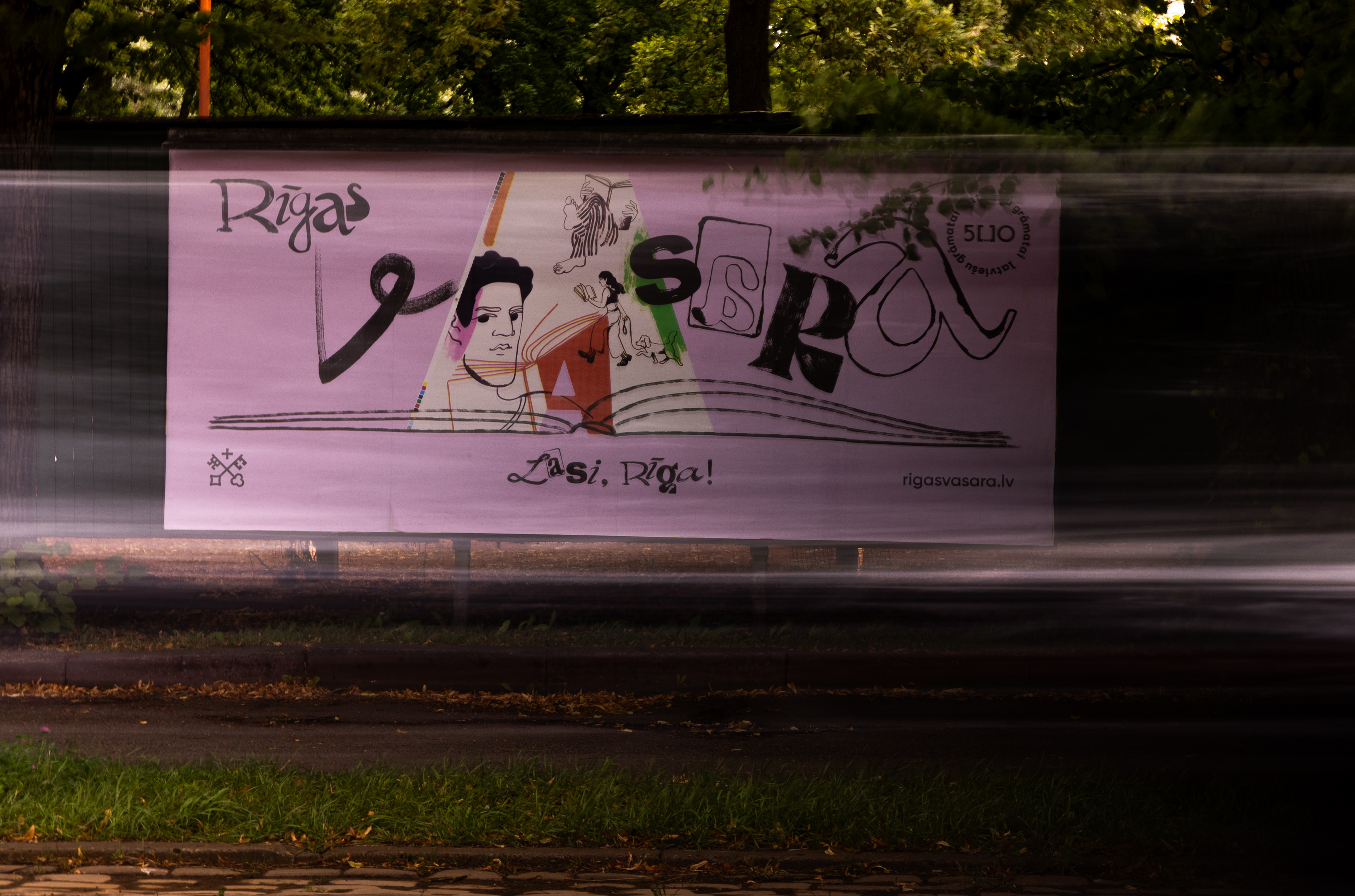
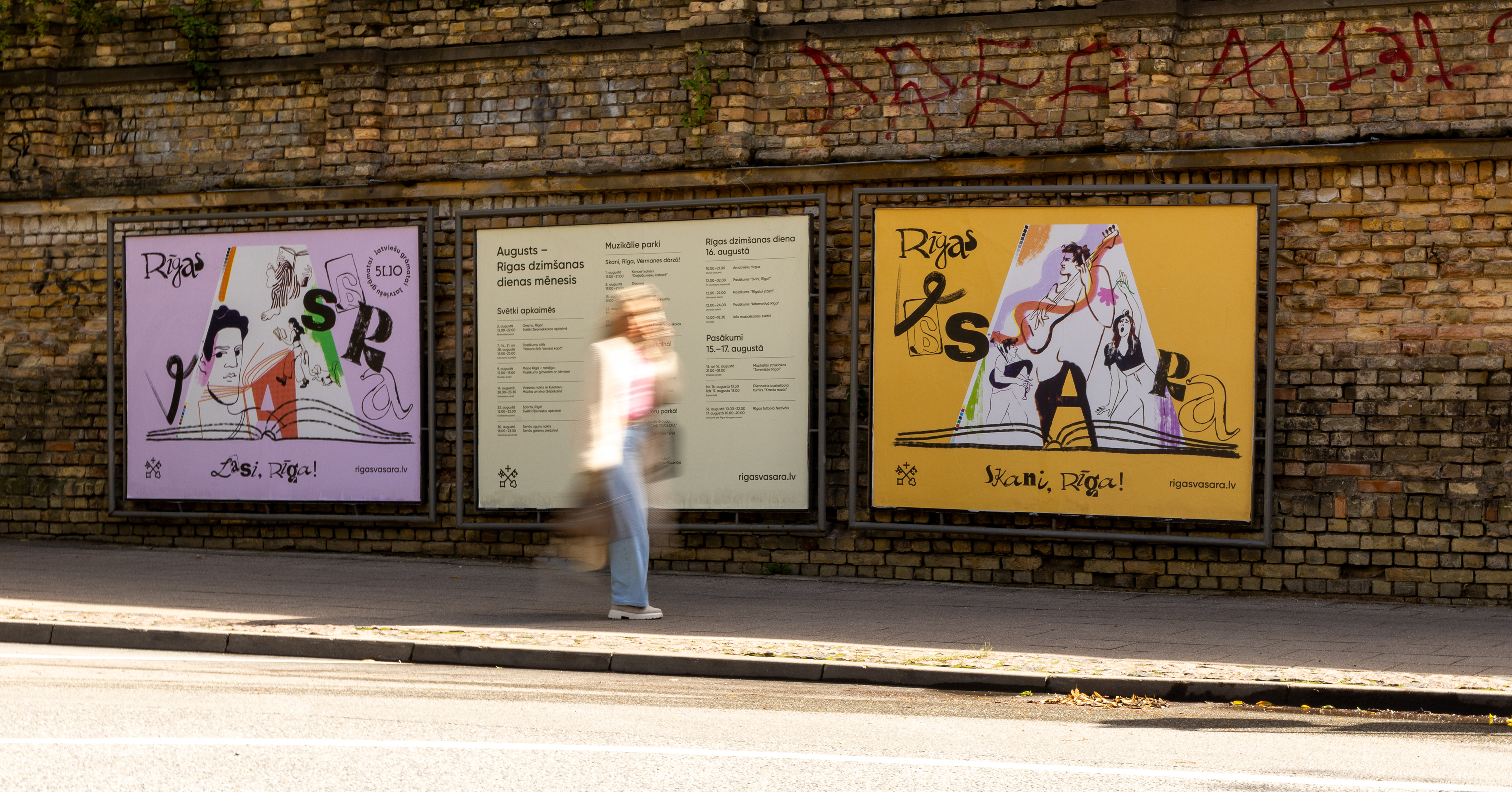
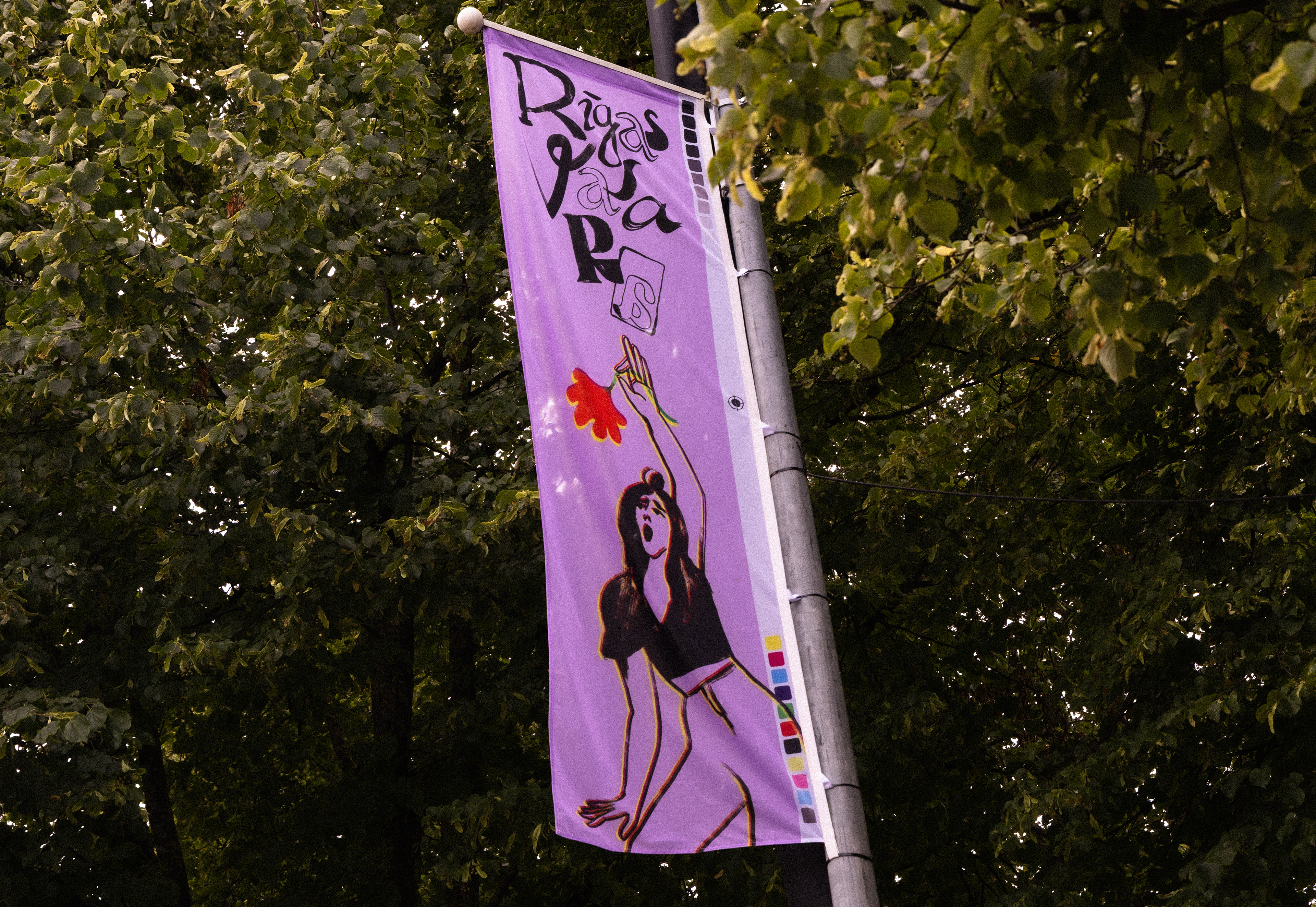
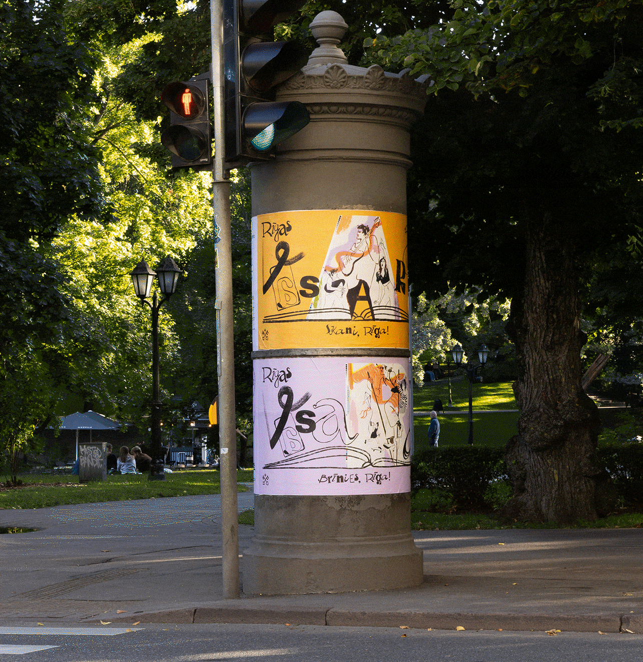
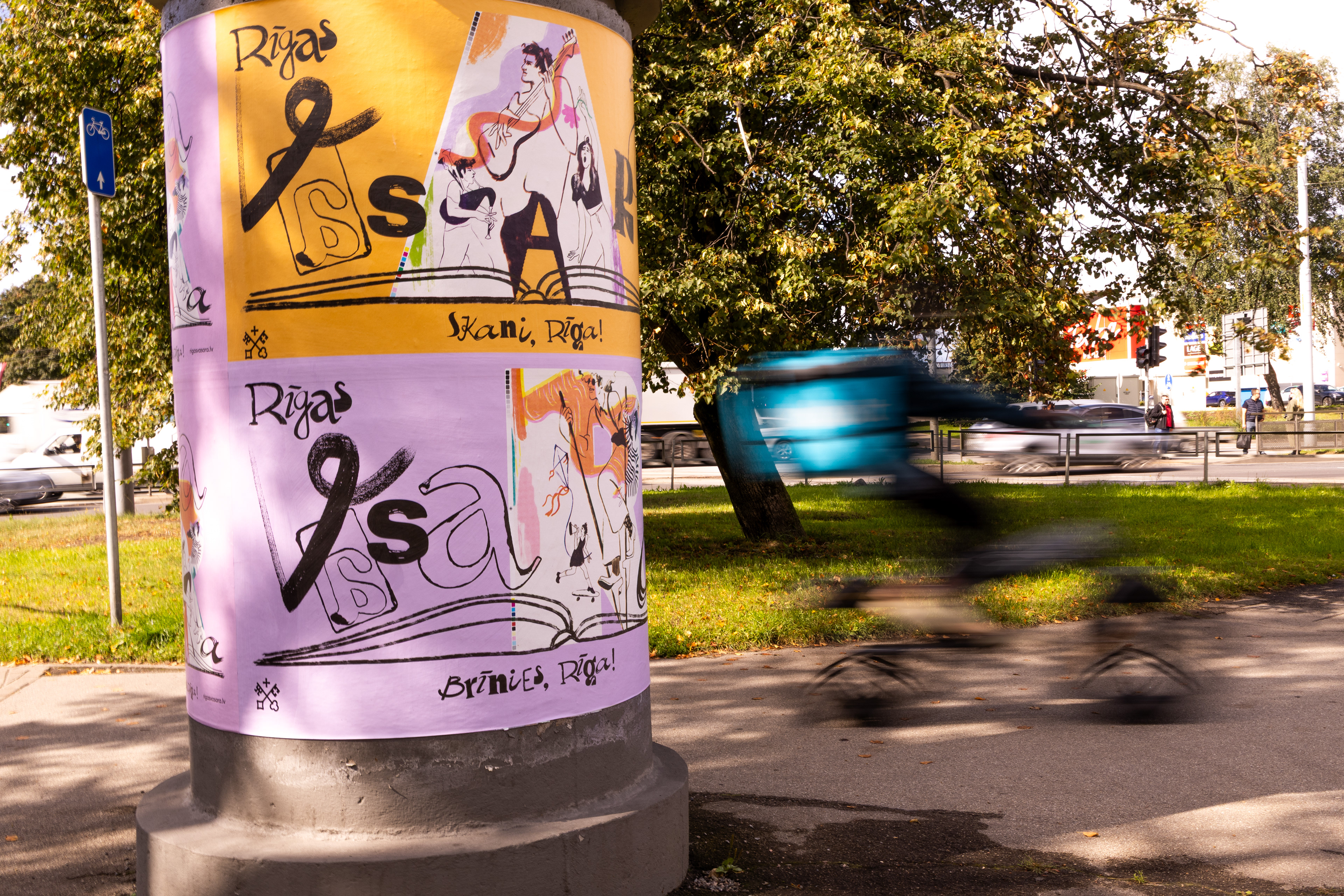
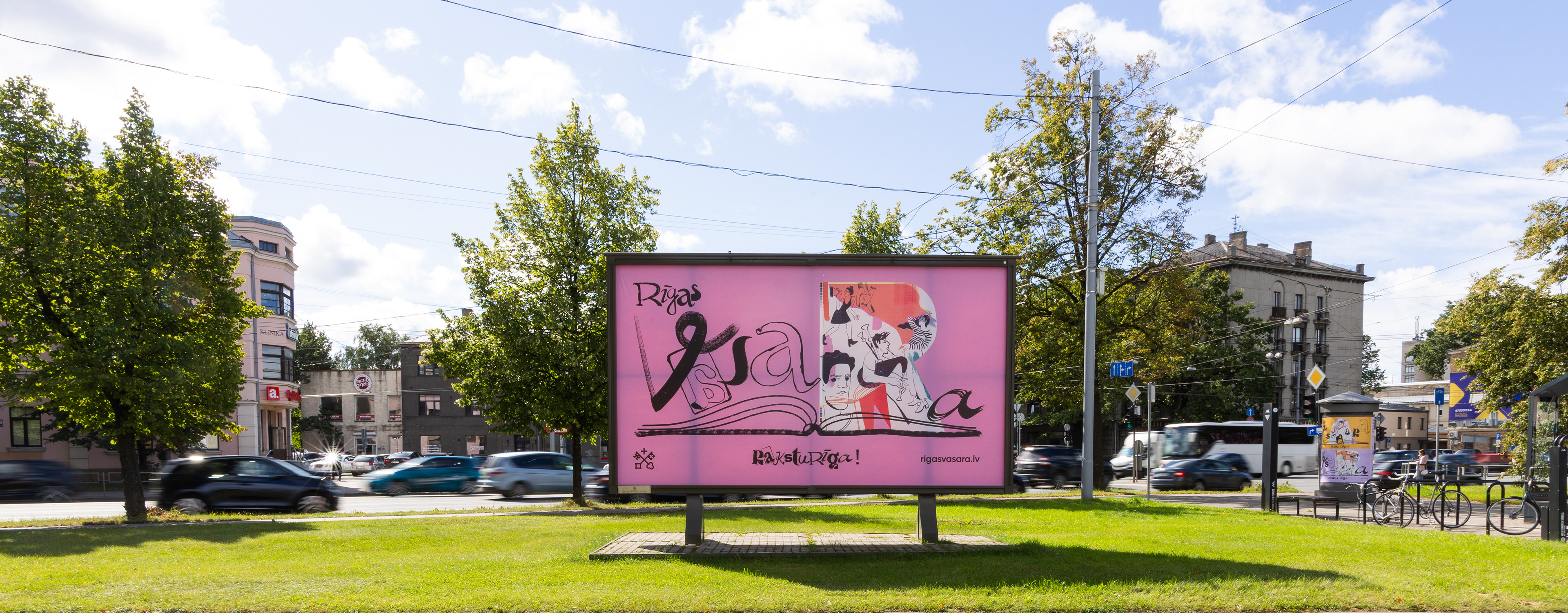
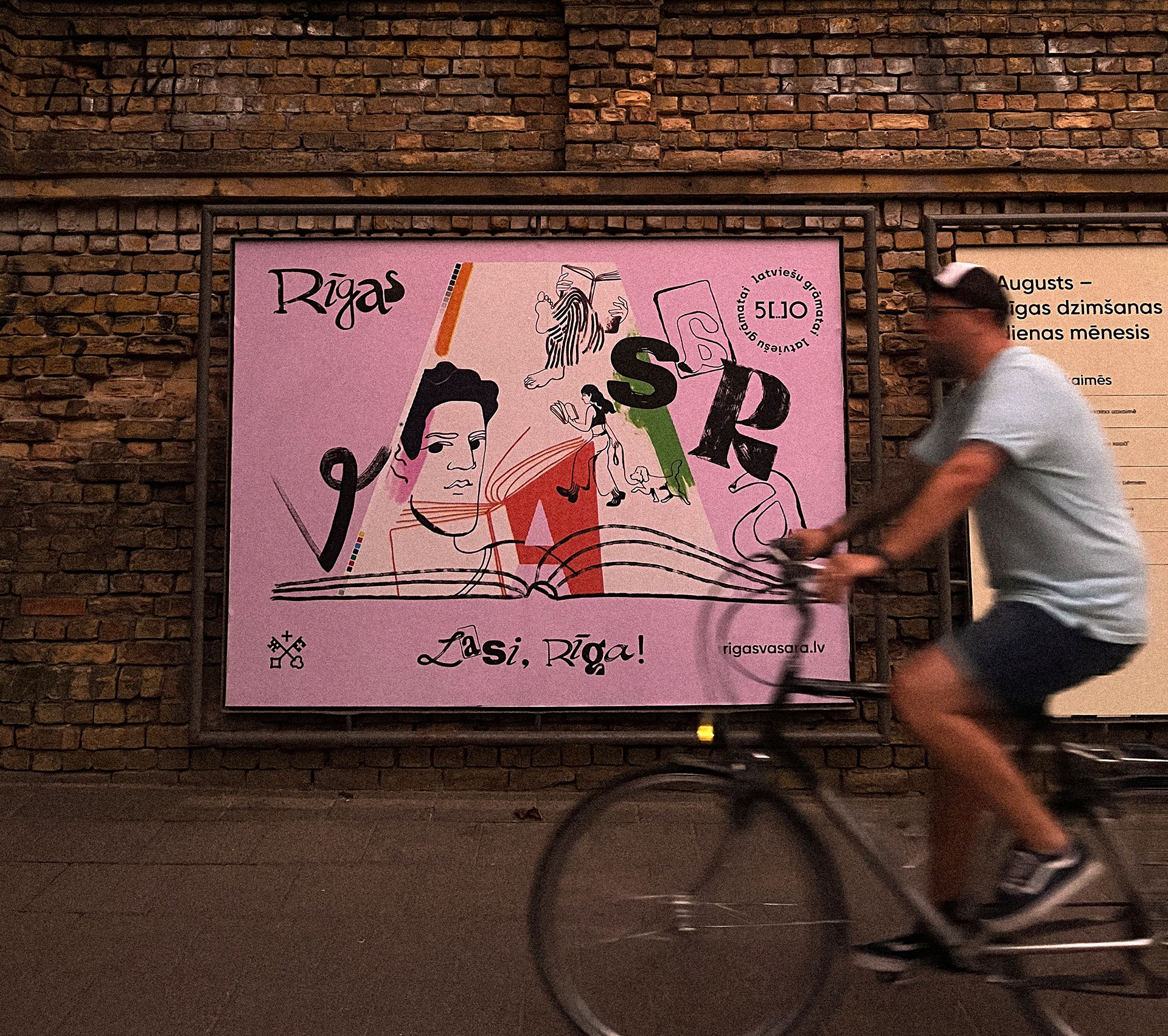
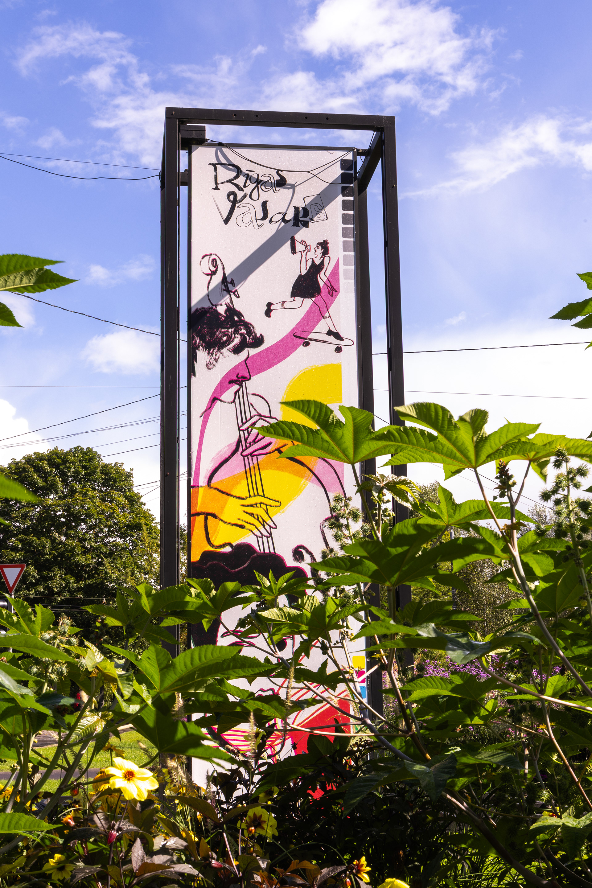
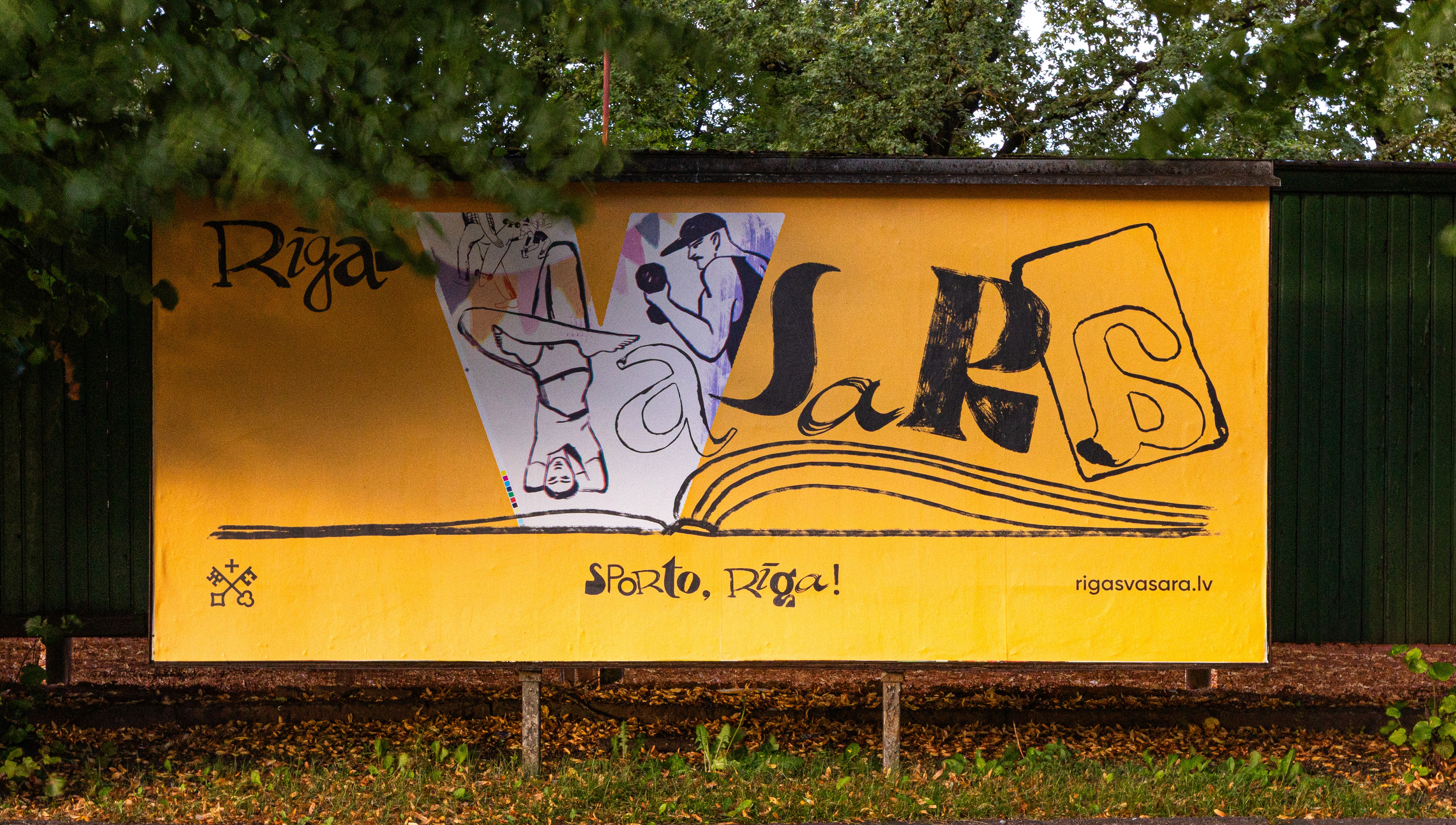
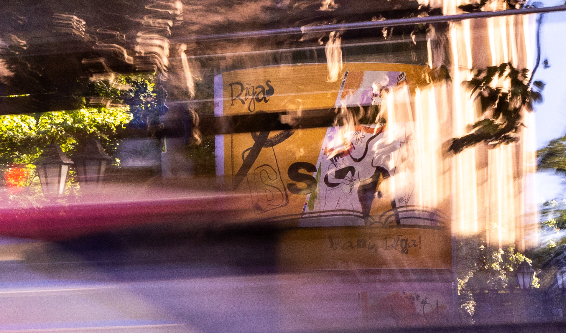
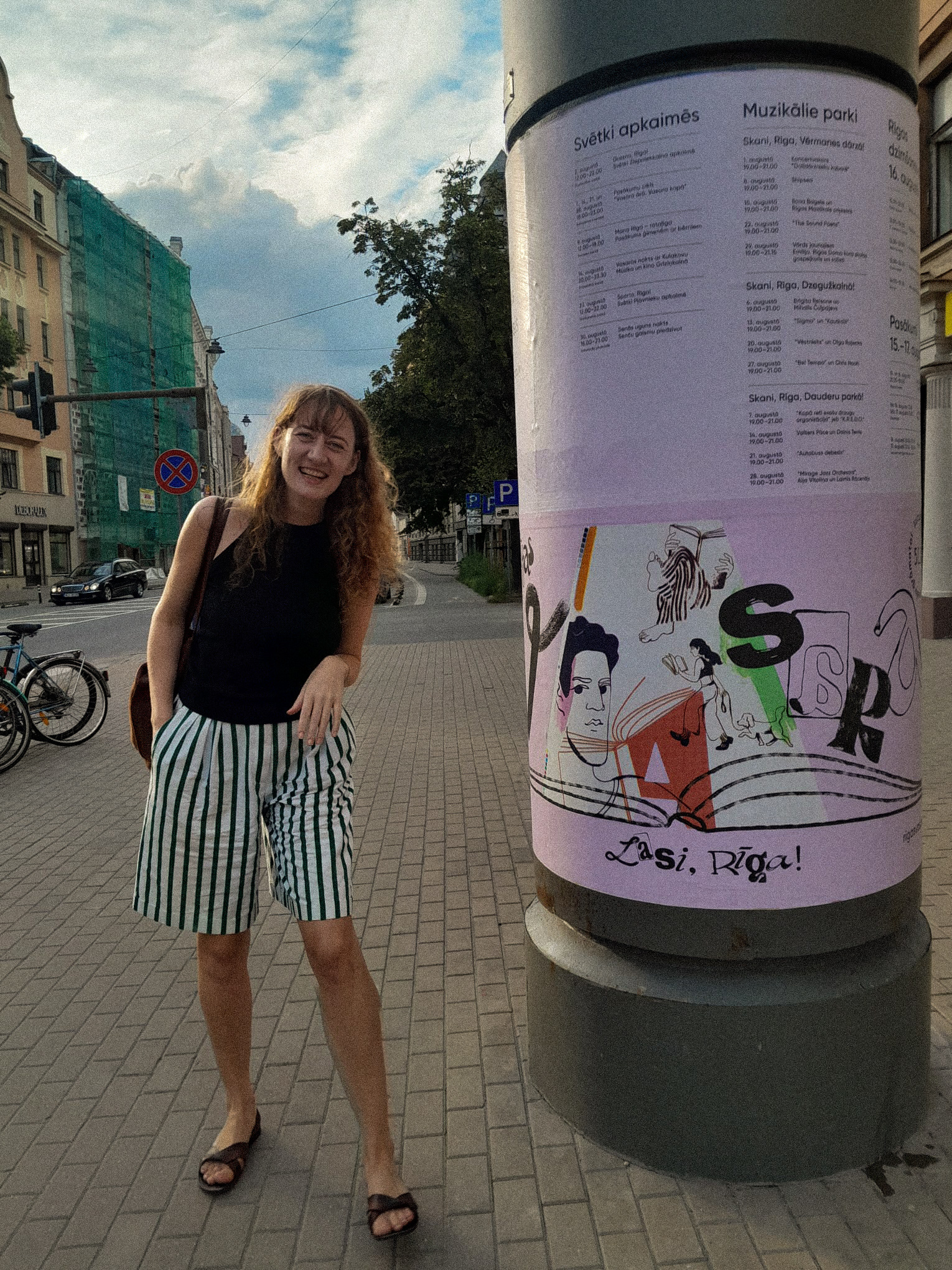
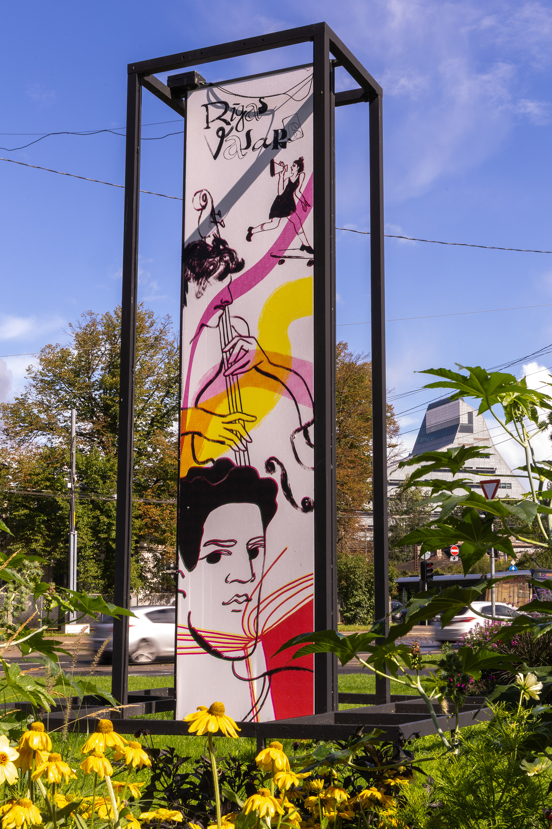
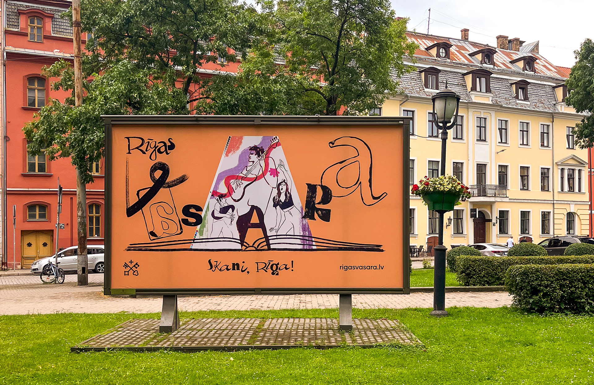
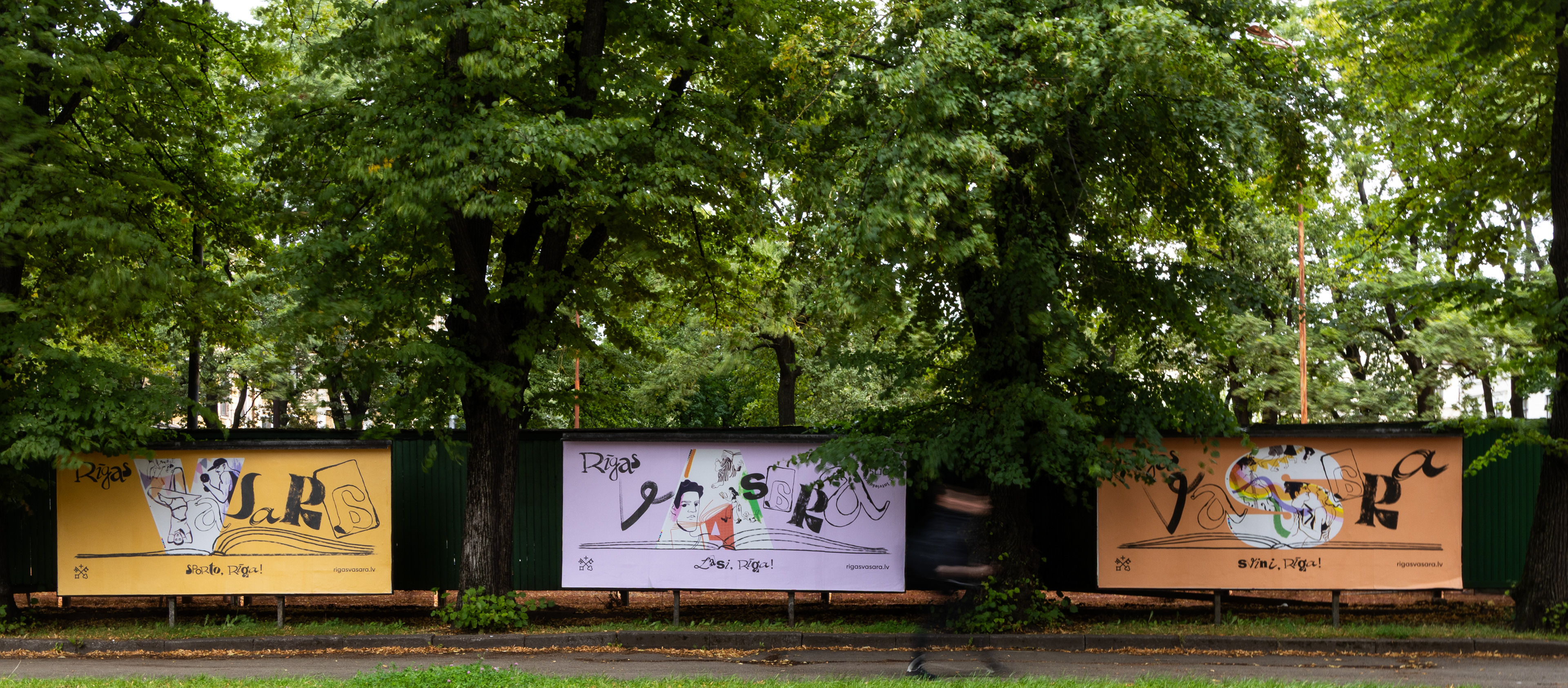
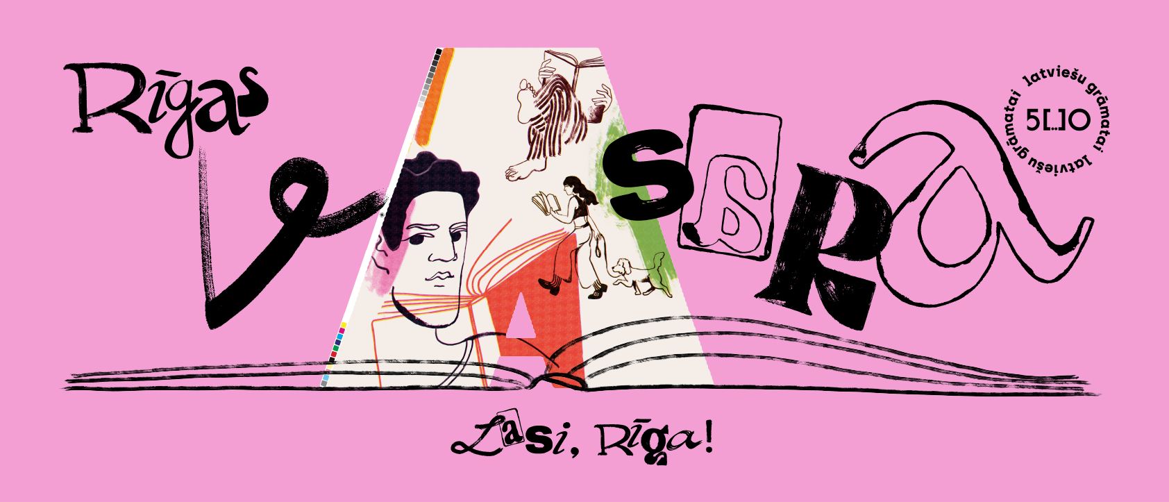
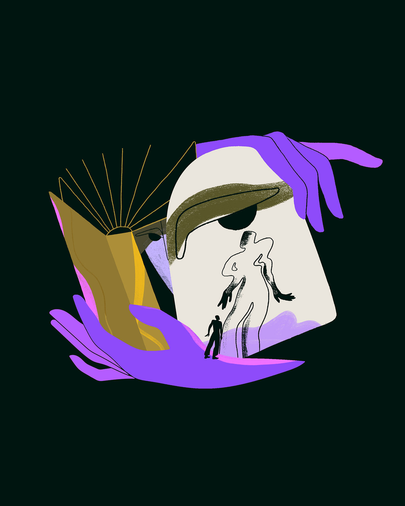
Raksturīga — Written Riga, Characteristic Riga
This year we celebrate 500 years since the first book was written in Latvian.
The word “raksturīga” usually means characteristic, but when split into “rakstu – Rīga” becomes “written – Rīga”.
In this way, Raksturīga speaks of the written word in our culture and of the qualities we share as a community, a city, and a people.

The Riga City Council invited me to create the visual identity for this year’s celebration
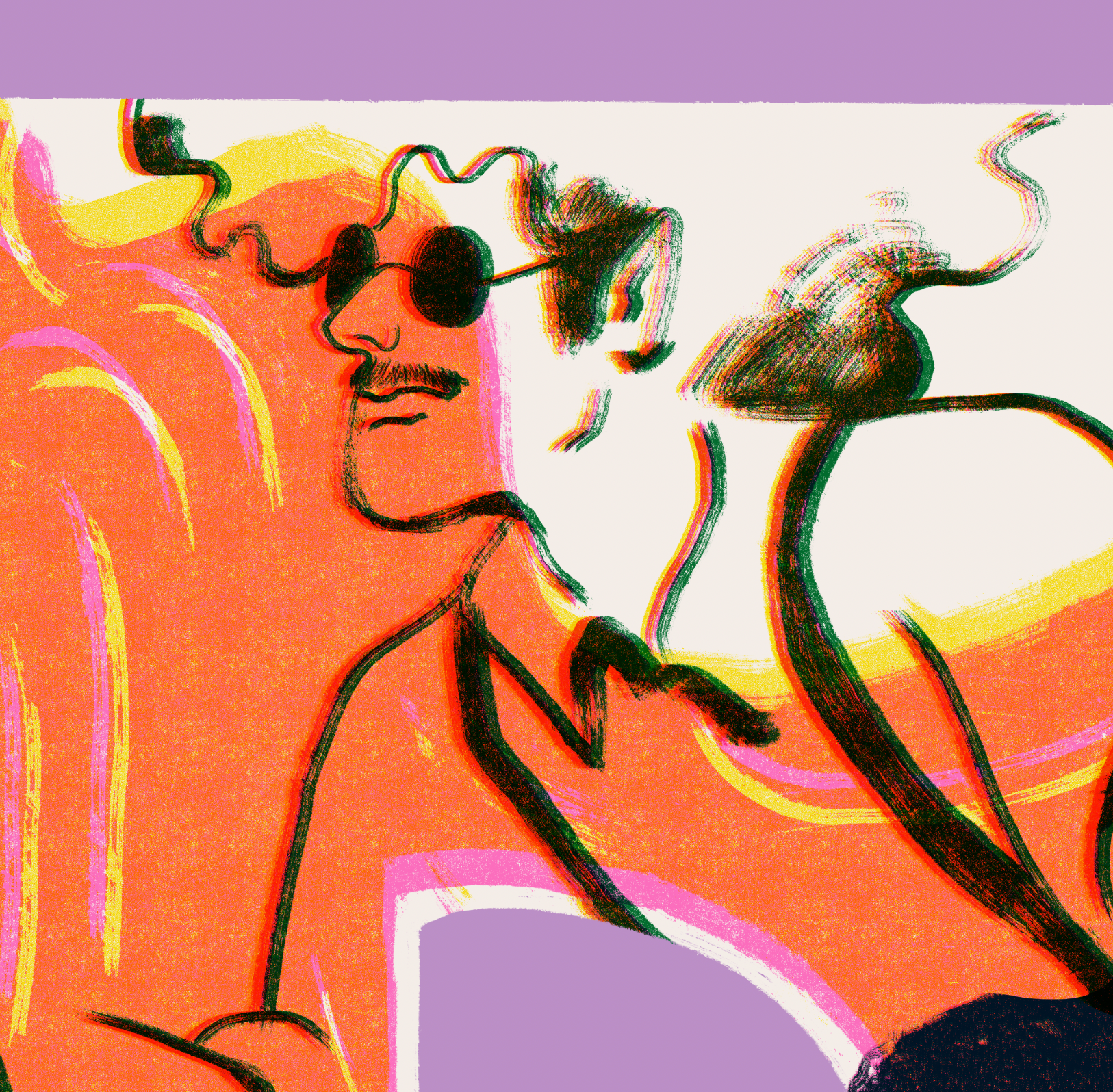
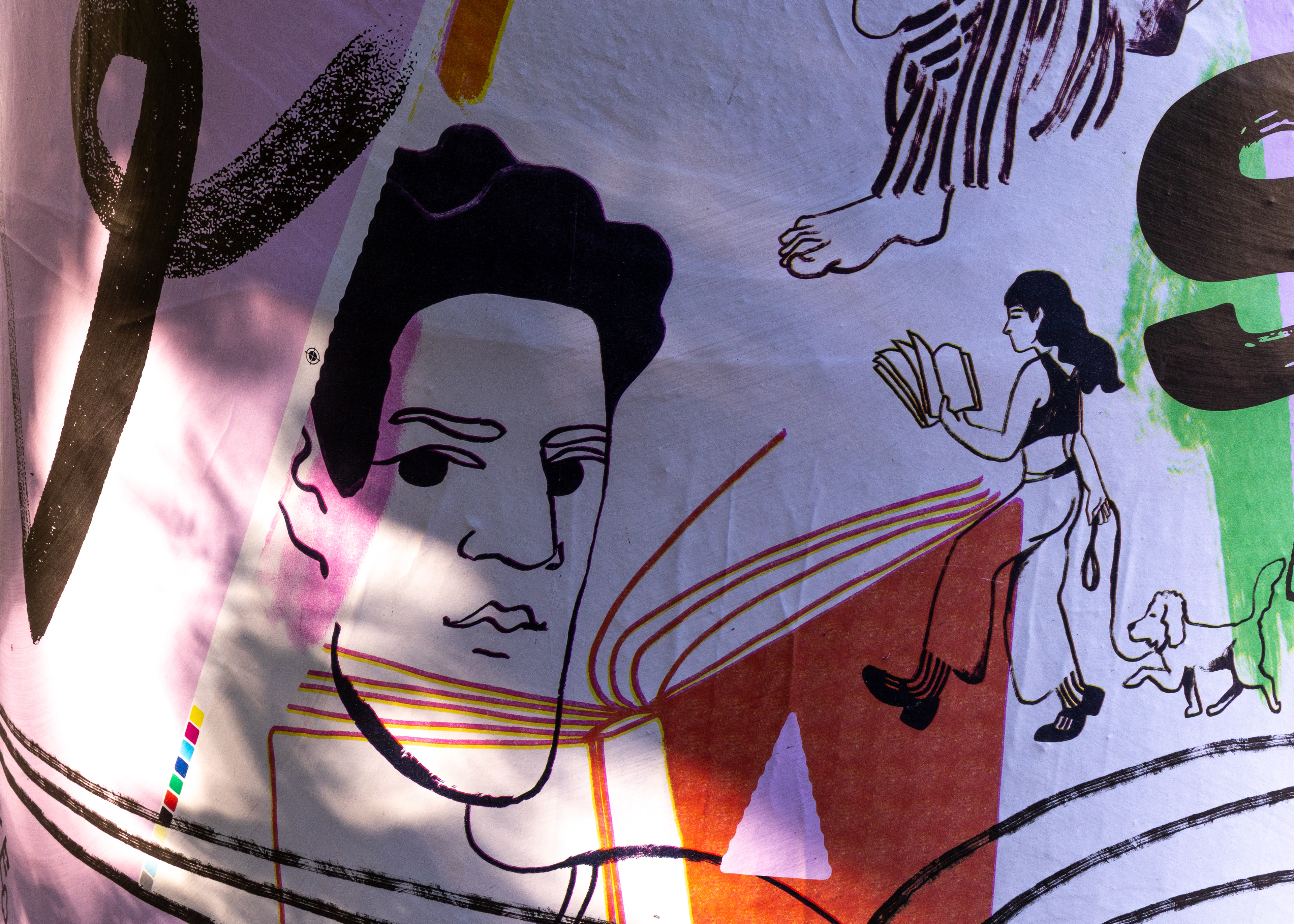
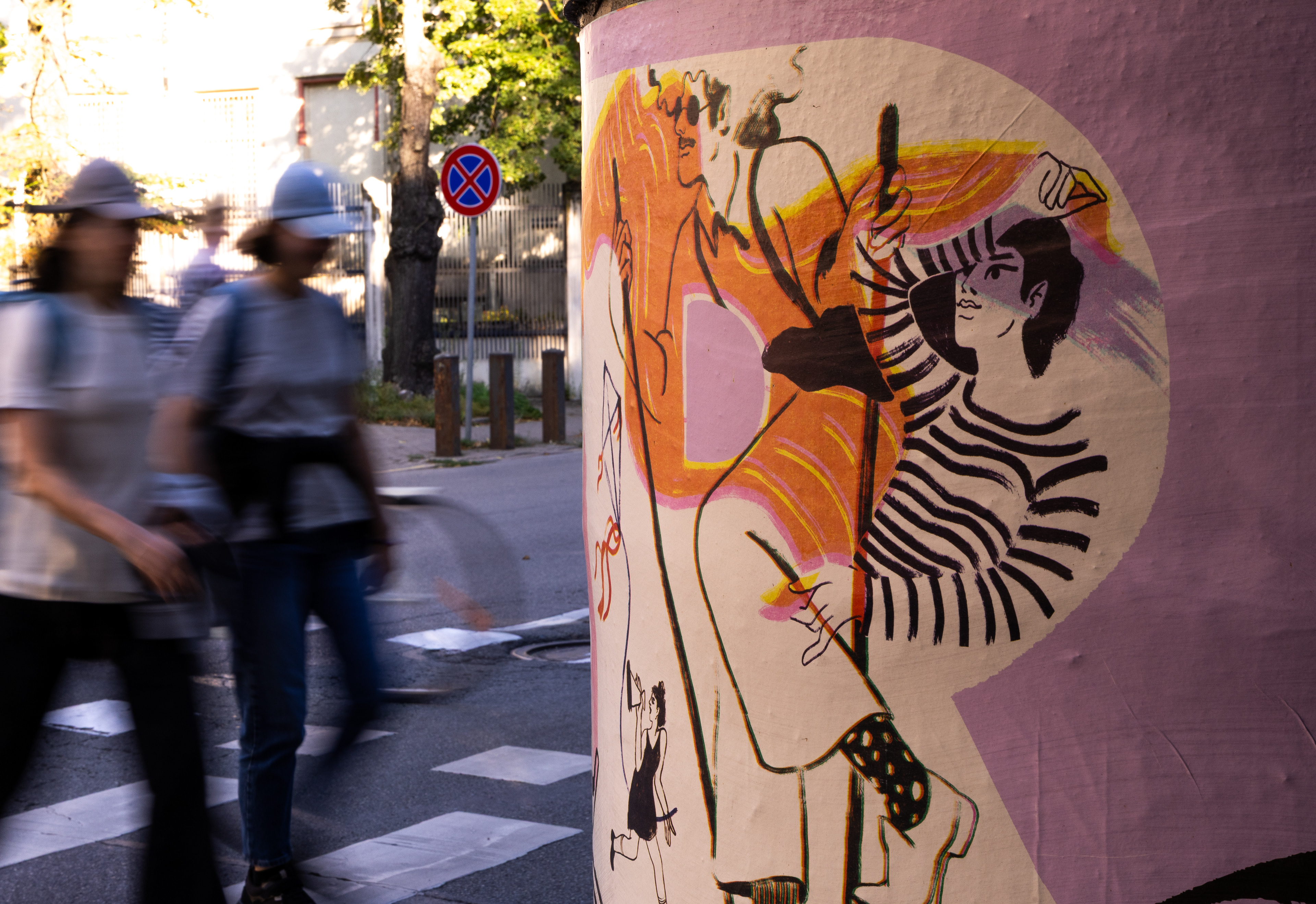
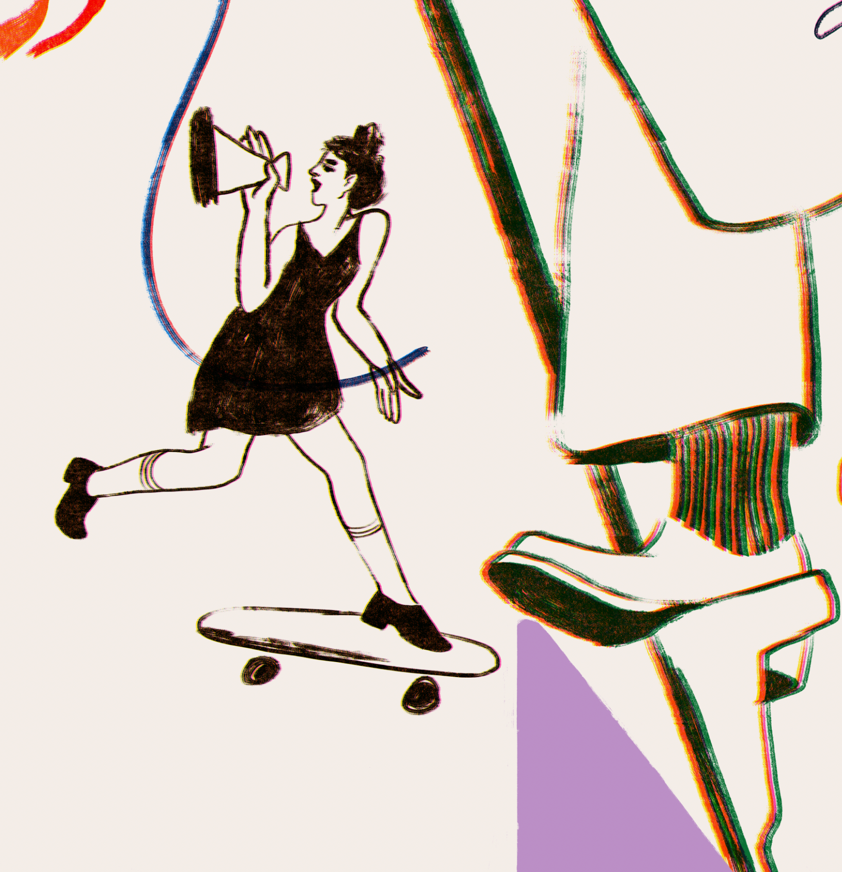
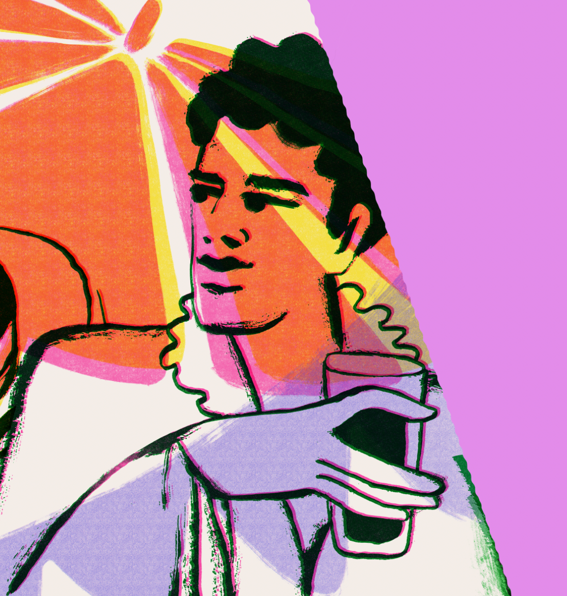
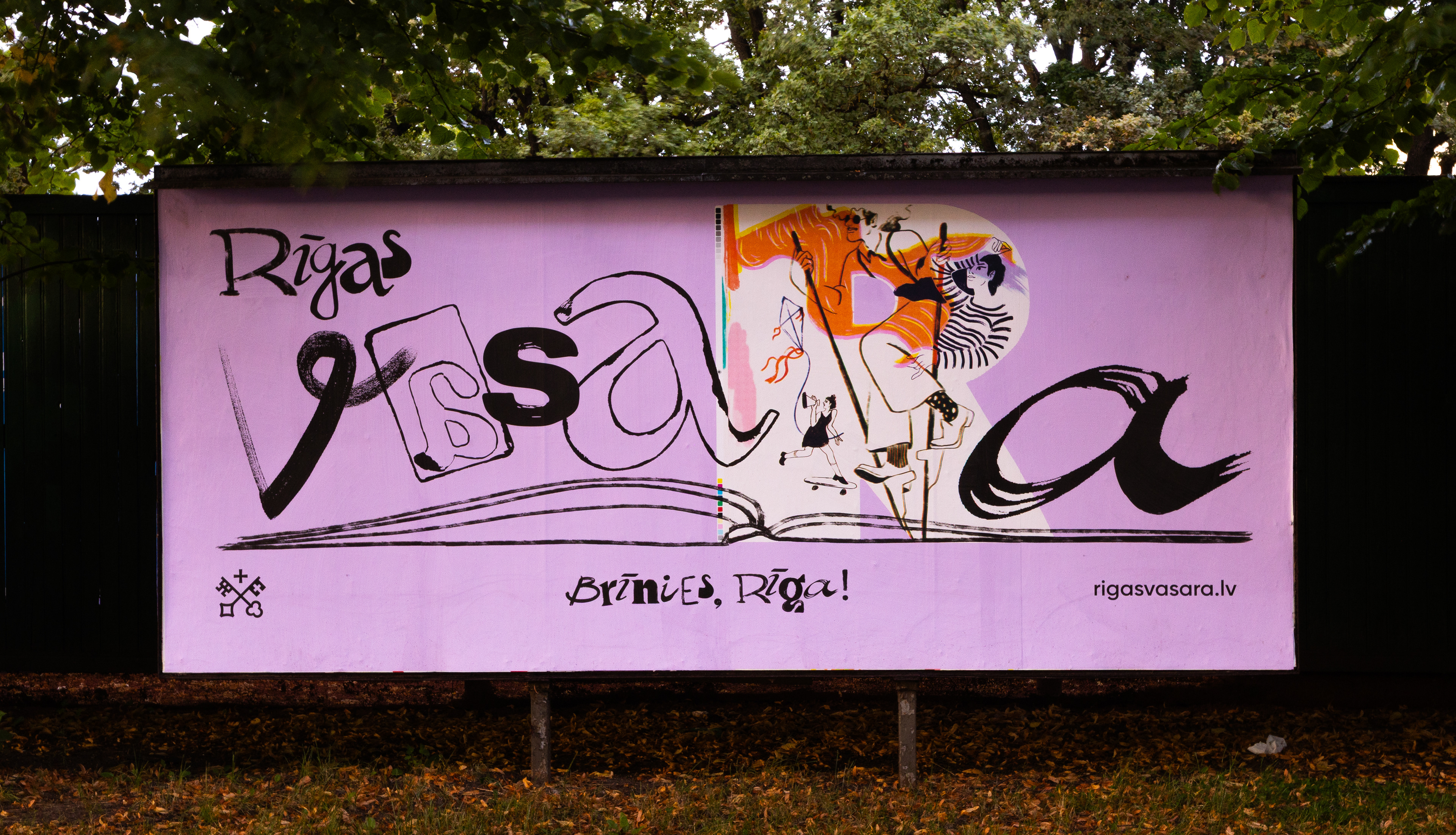
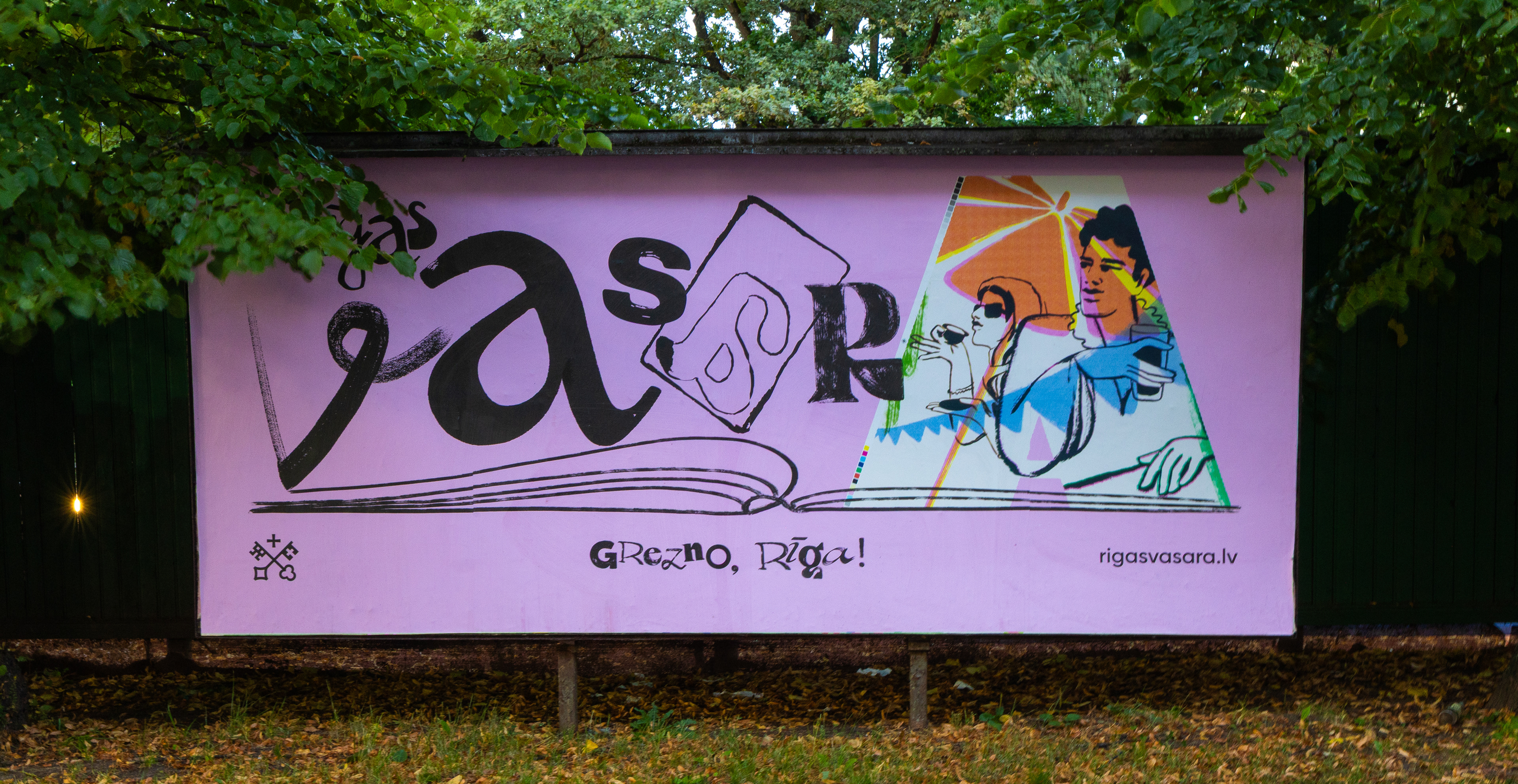
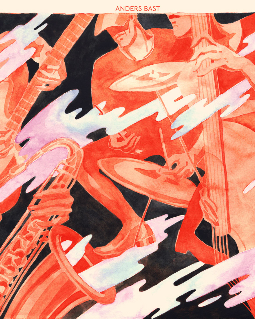
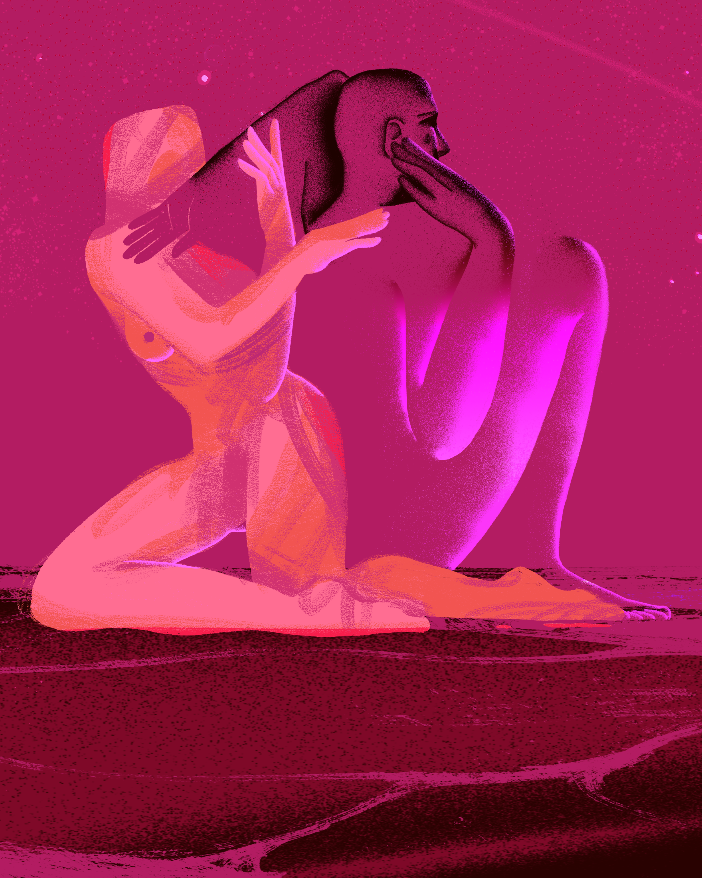
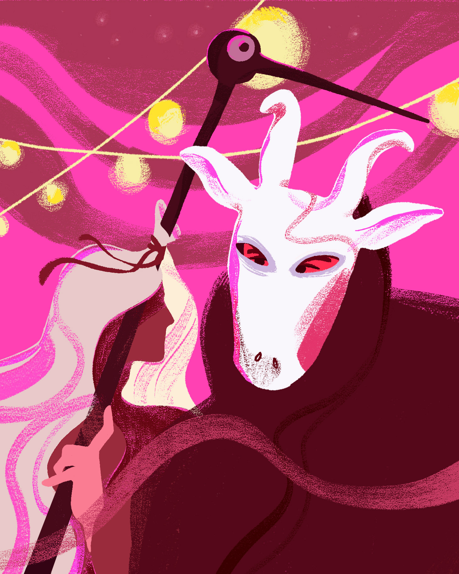
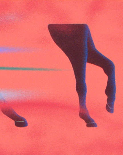
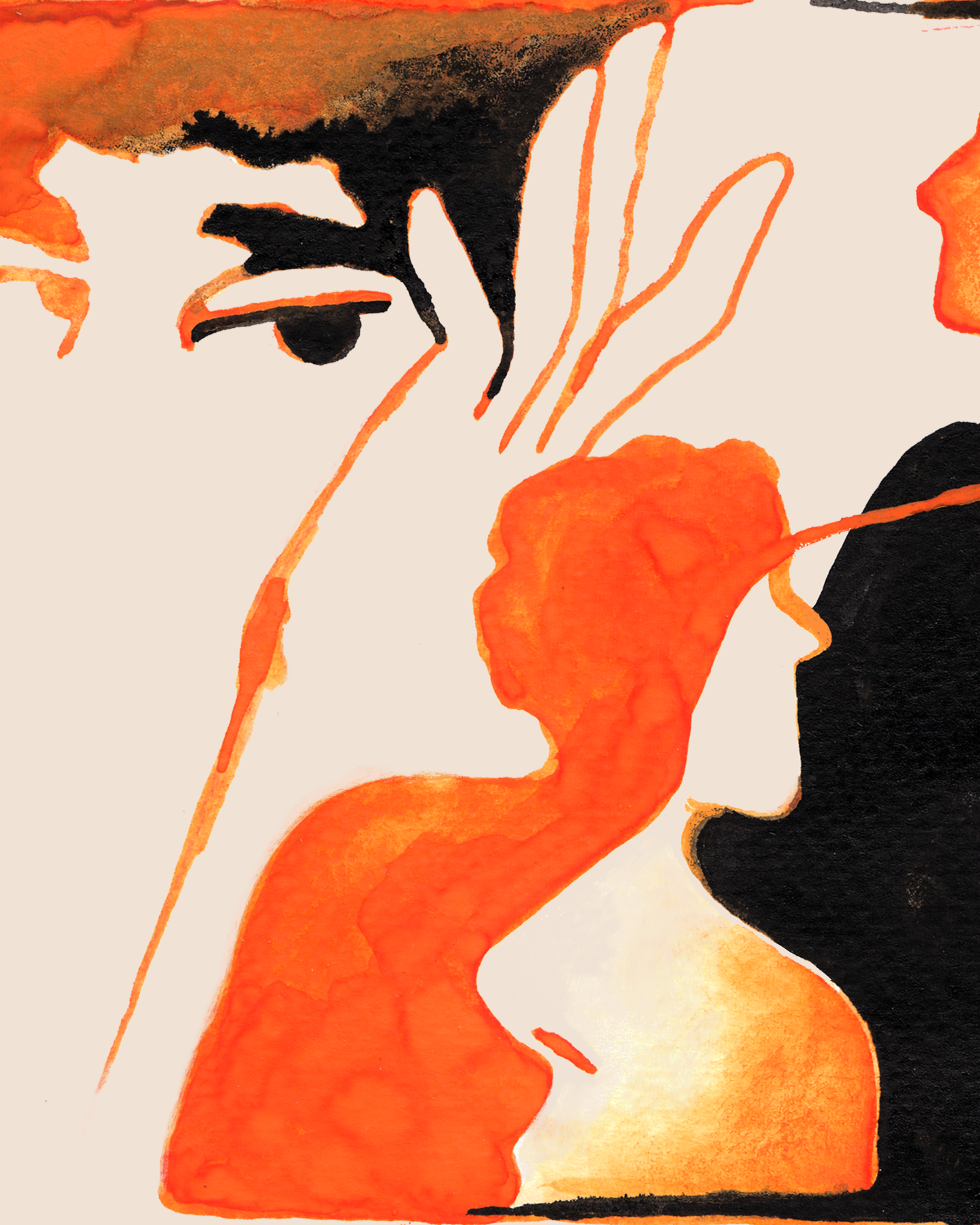
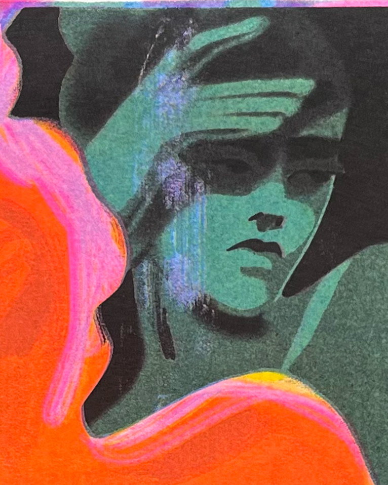
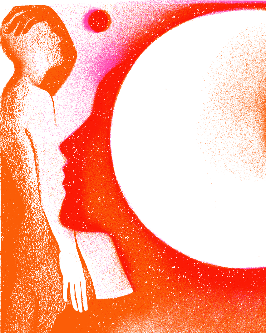
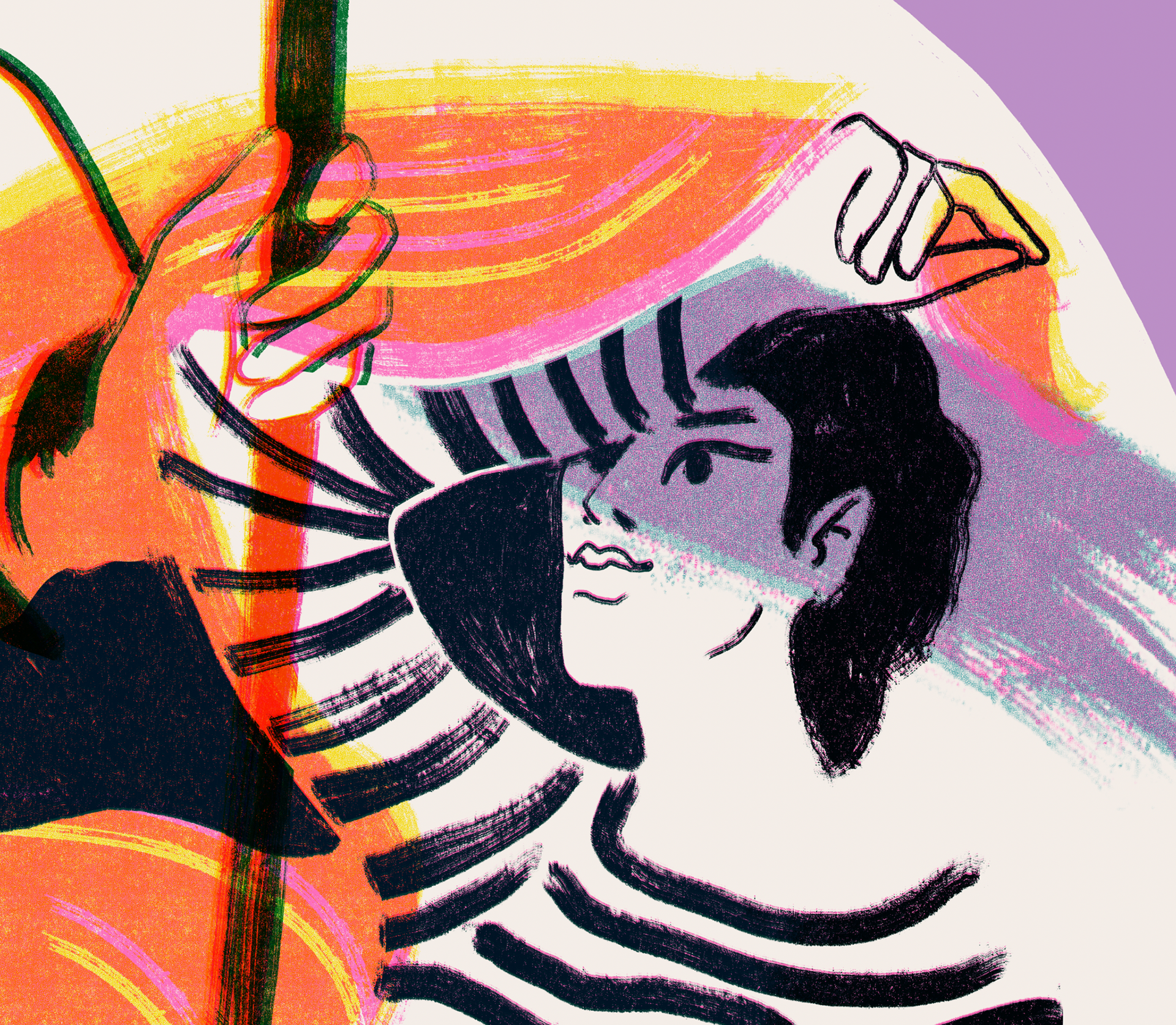
For the visual language, I chose to turn “behind-the-scenes” into a metaphor—a symbol of co-creation, whether it’s making a book, a celebration, or the vibrant life of a city.
That’s why you’ll find behind-the-scenes fragments of city life, along with traces of the creative process itself: ink stains, screen-print marks, crop marks, and risograph overlays—opening the doors to the world of book-making.
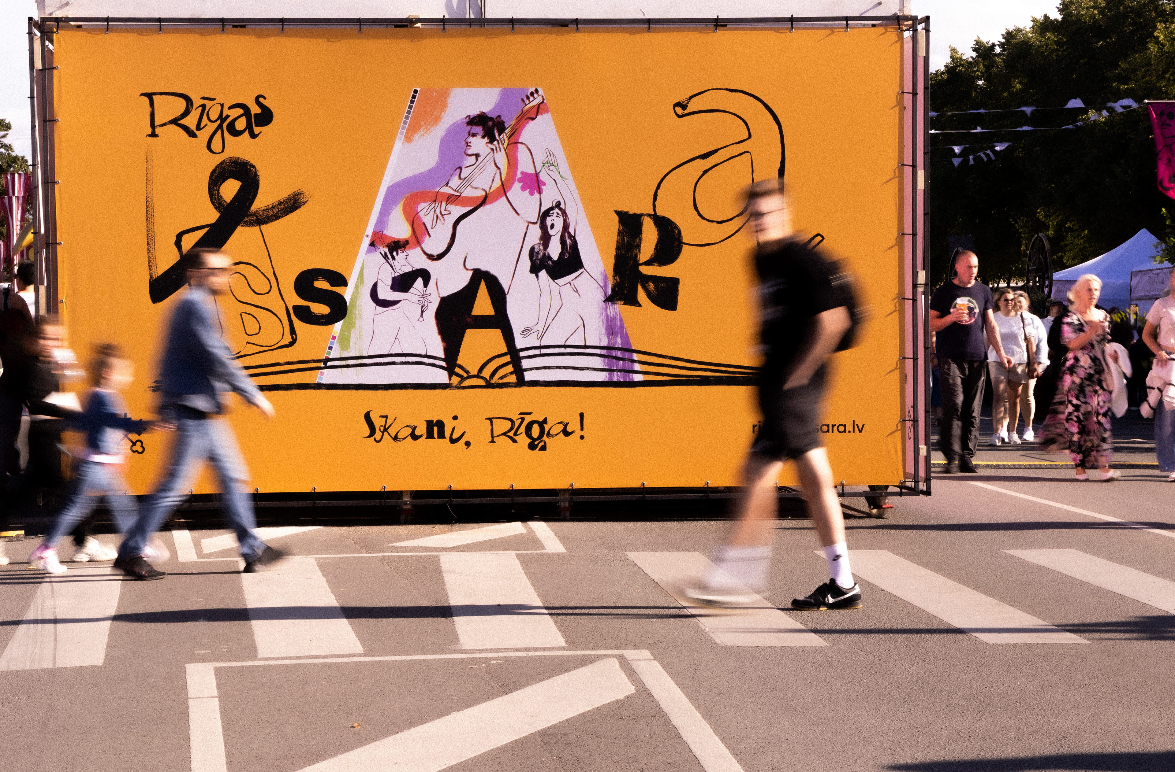
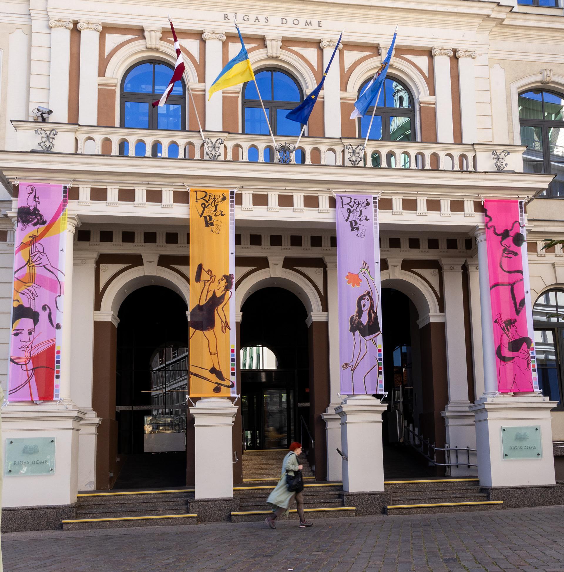
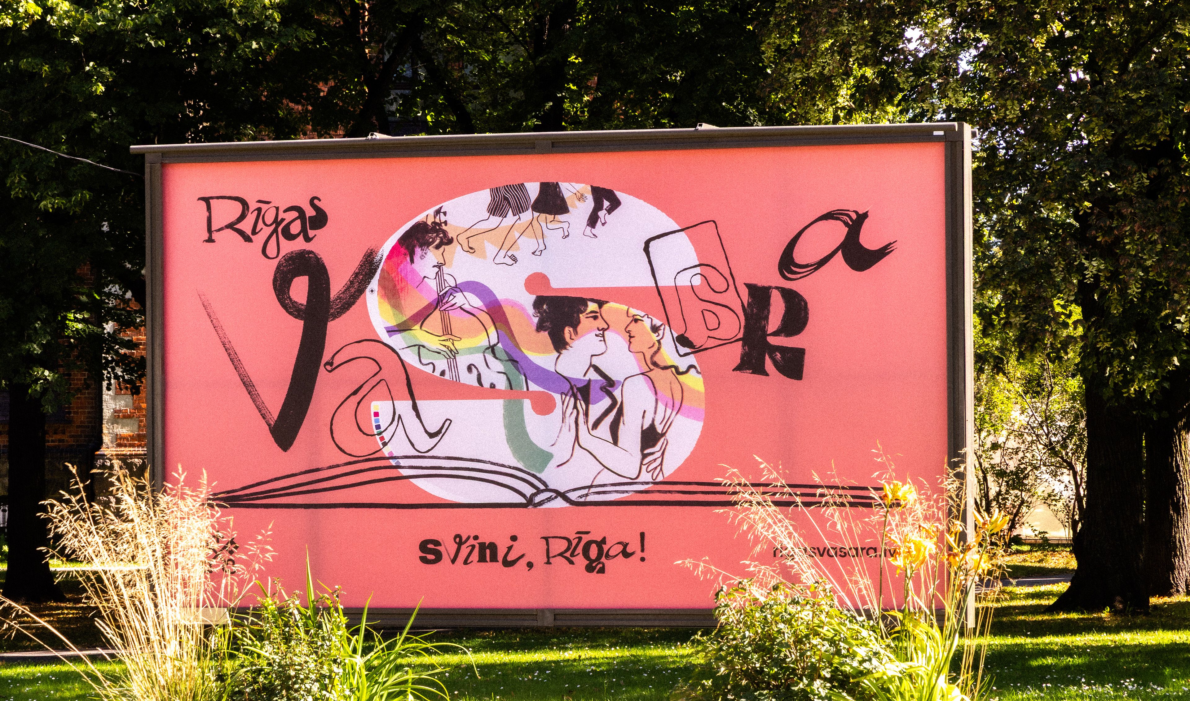

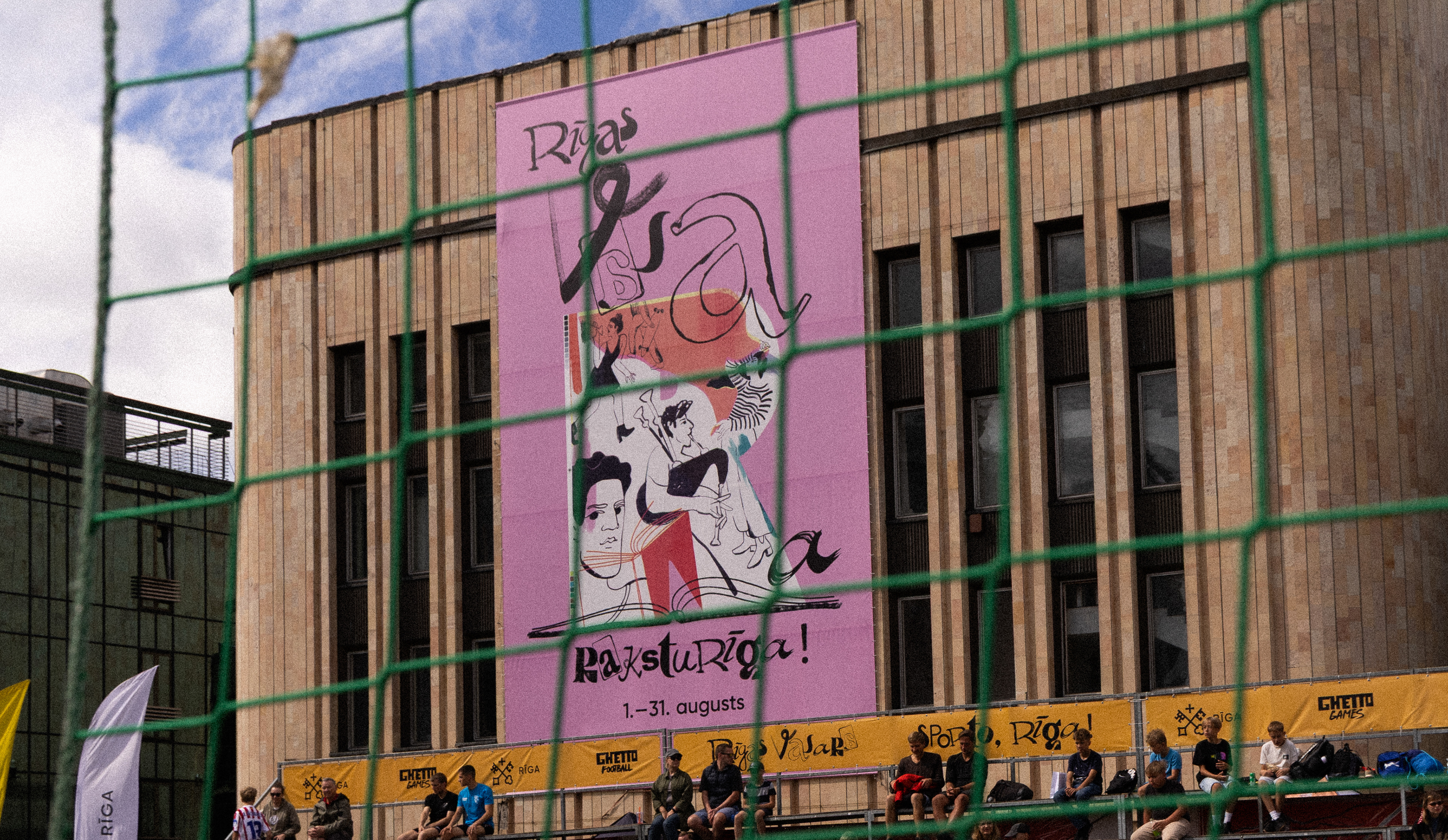
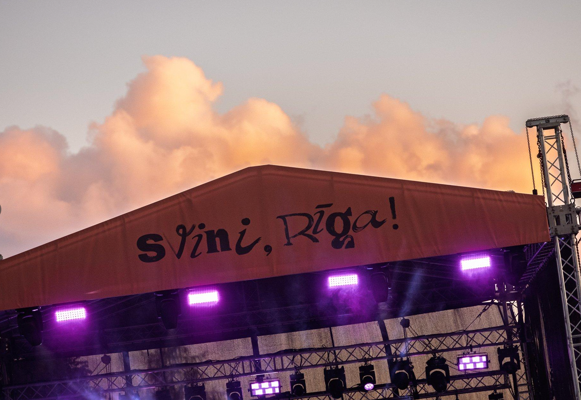
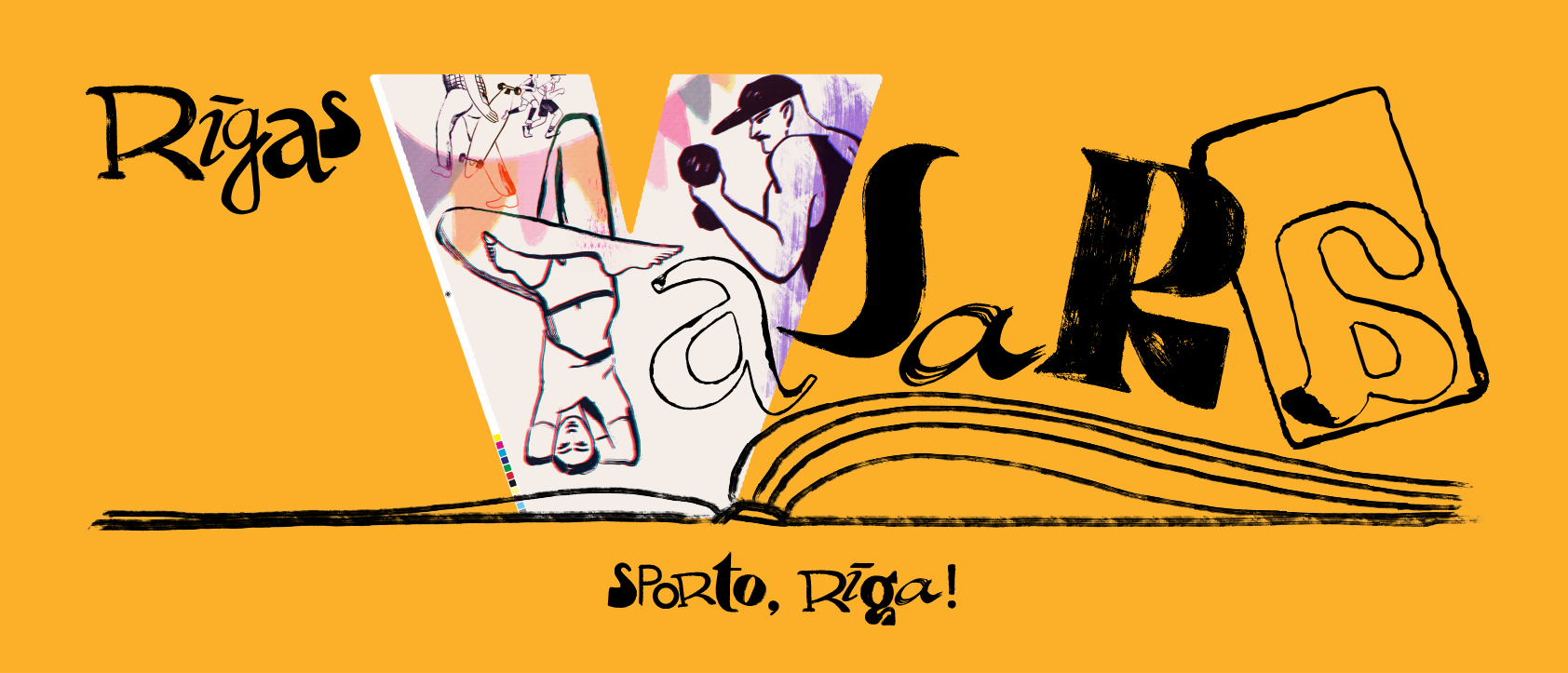
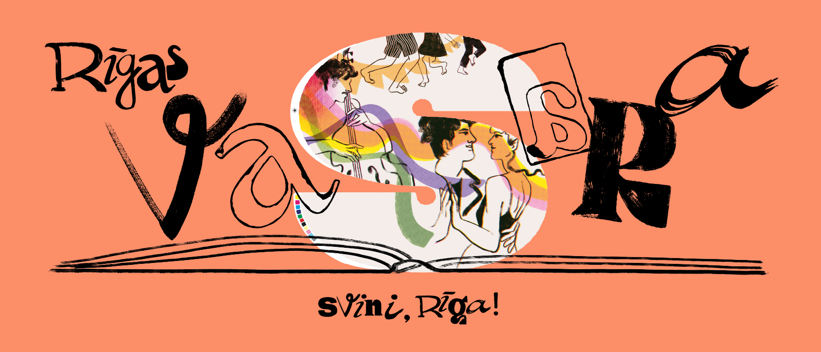
The design unfolds across seven event themes, each echoing a different way people here live, celebrate, and connect. Together, they map out a city in motion — where everyone is both participant and storyteller.
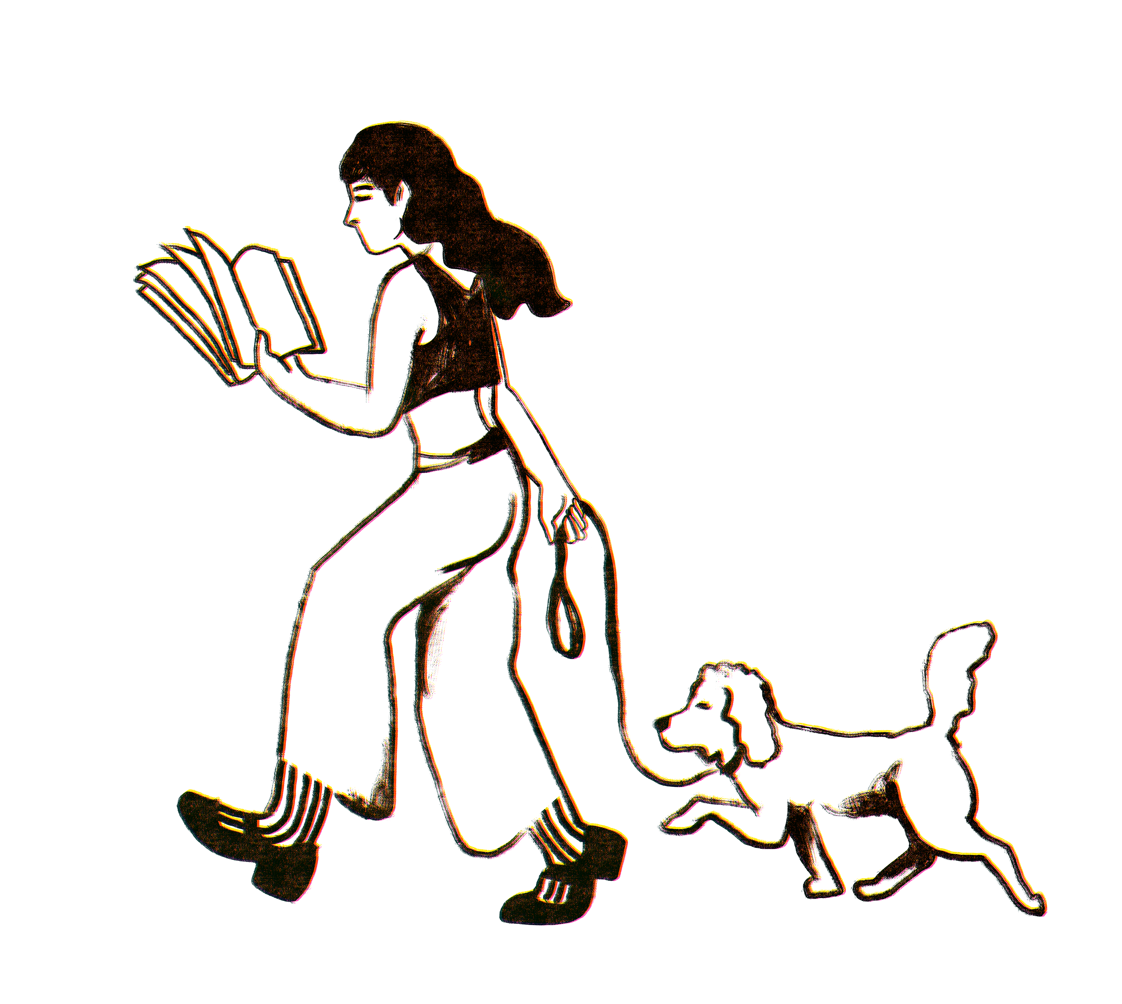
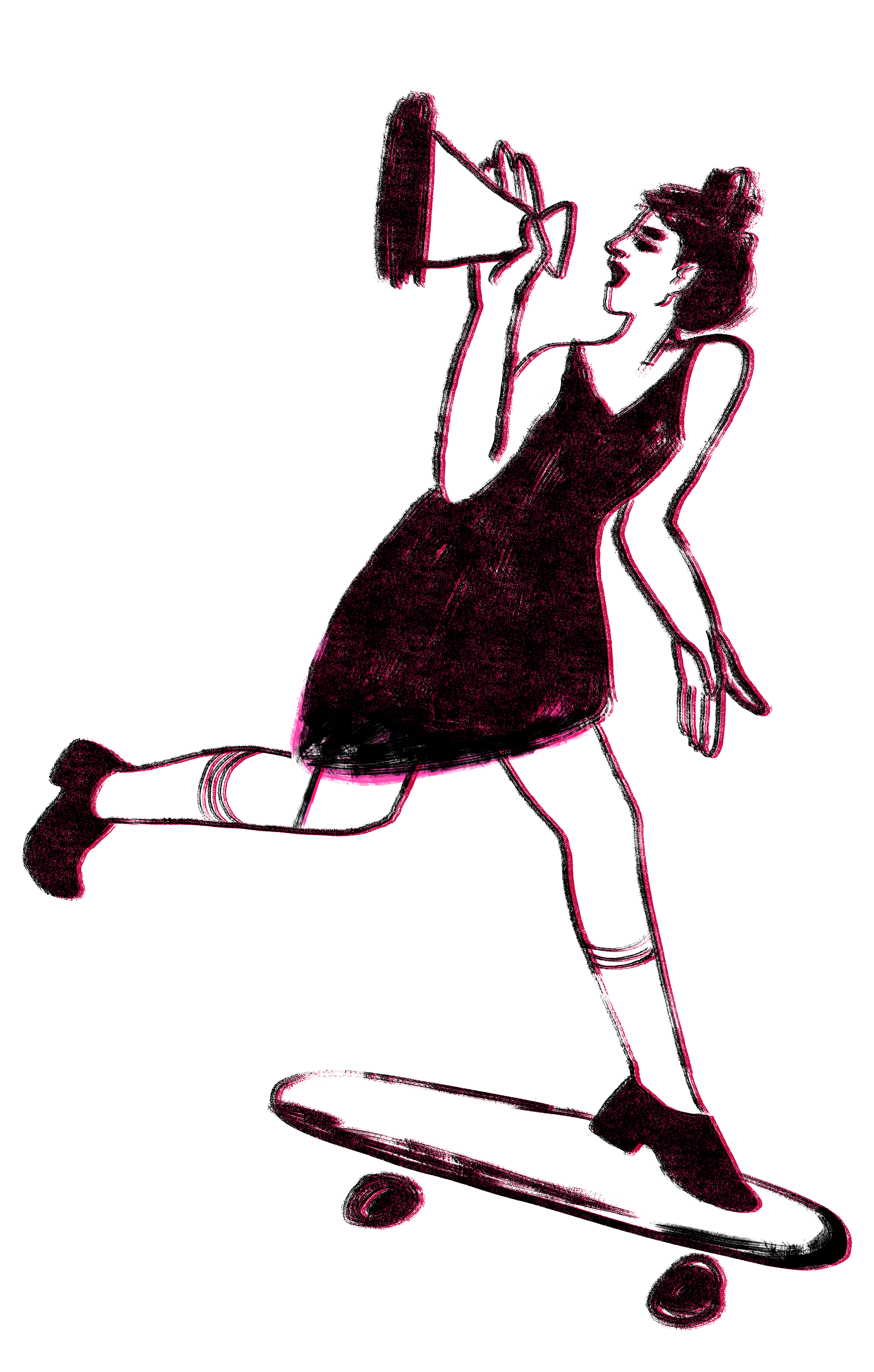
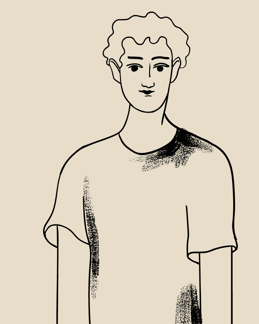
The visuals are crafted using a mix of traditional and intuitive techniques — including freehand ink drawing, typographic exploration, and print-inspired textures.
I intentionally preserved imperfections, such as smudges, torn paper edges, and ink bleeds, revealing the raw beauty often hidden behind polished surfaces.
This approach reflects storytelling that is personal, tactile, and alive — where each stroke, letter, and layer holds space for memory, feeling, and co-creation as a metaphor for vibrant city life, which is created by each one of us behind the scenes.